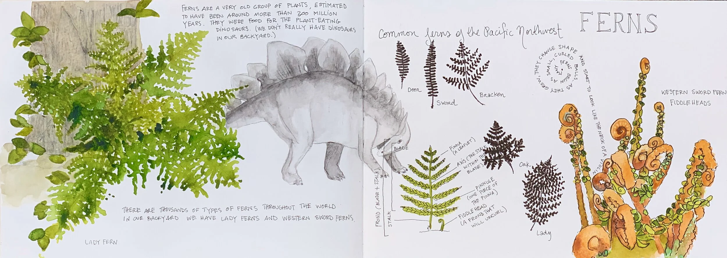
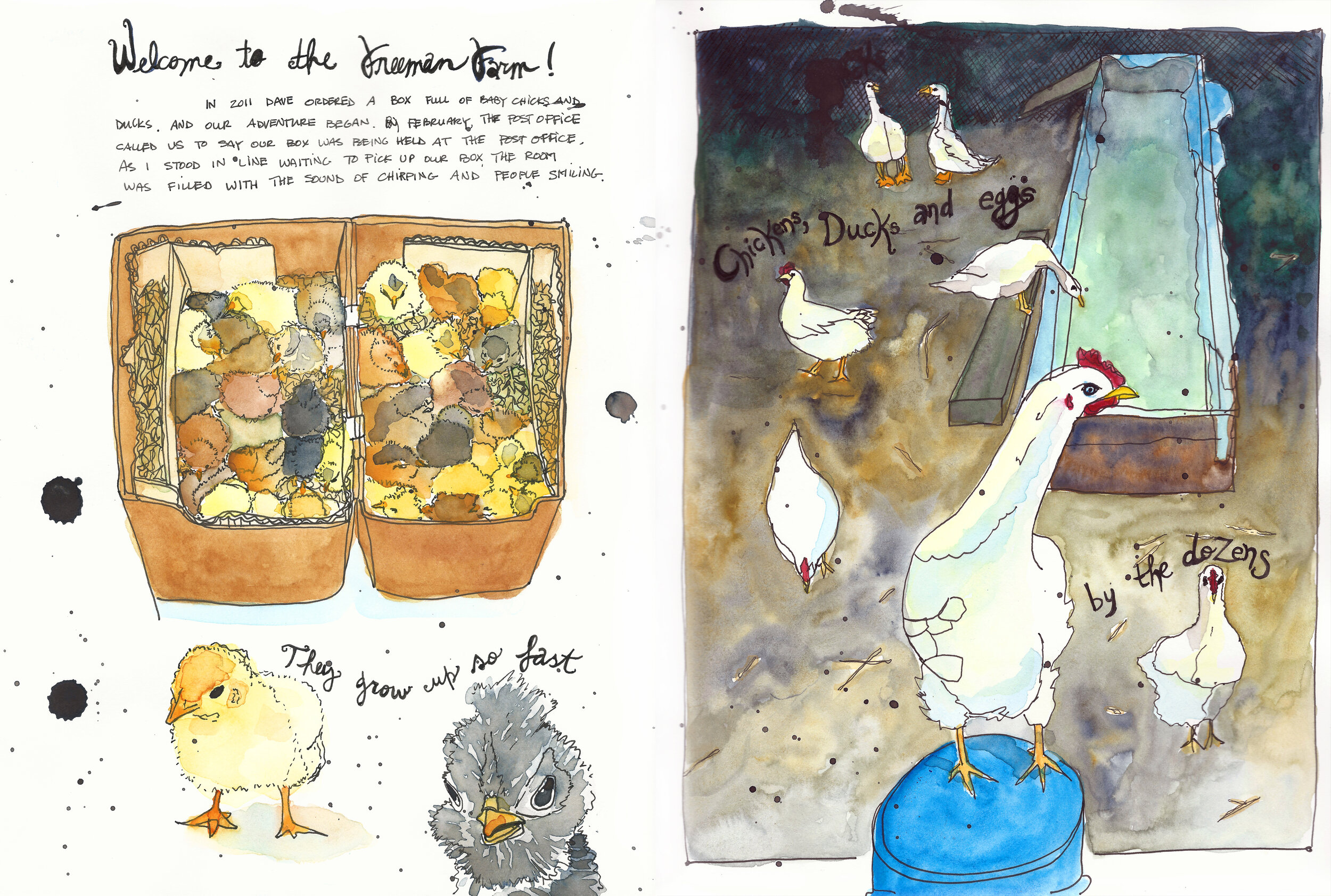
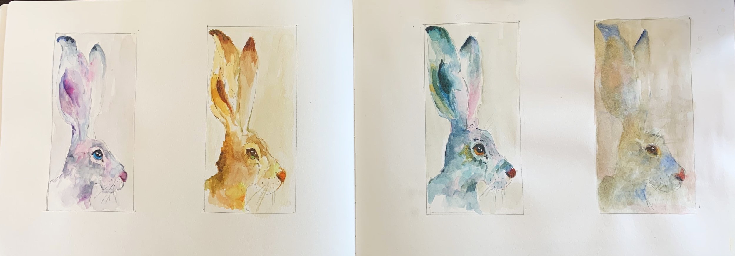
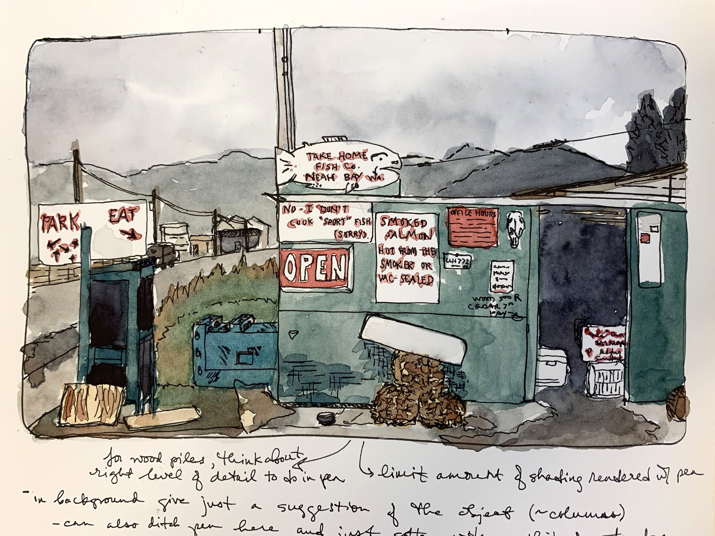
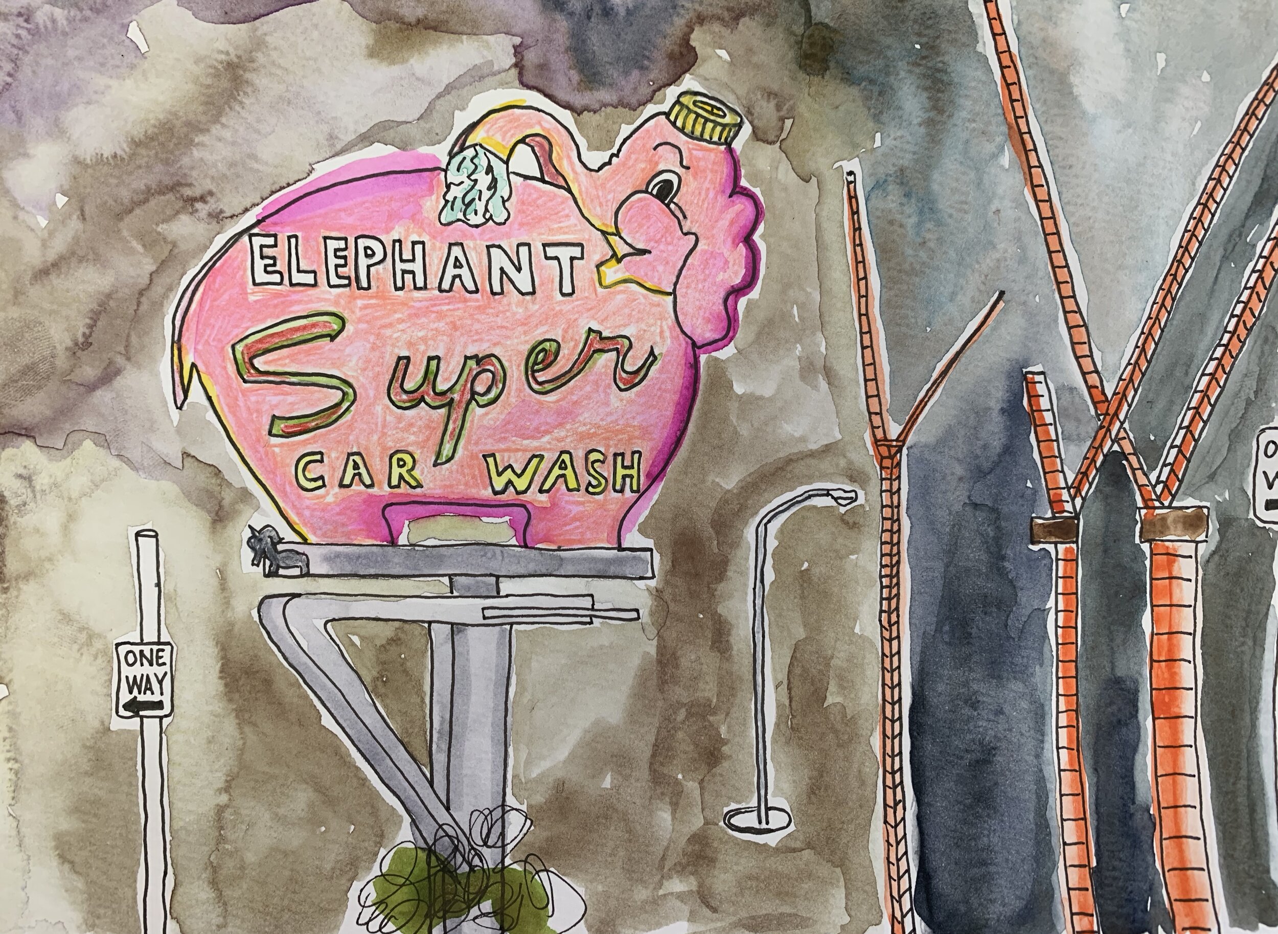
Yesterday I finished my most recent sketchbook diary. I love keeping a sketchbook as a way of documenting my life and connecting more mindfully with my world. I hope you enjoy this glimpse into this sketchbook.
Il Nonno
Last week I finished “Il Nonno,” a 15” x 22” watercolor. Il nonno means grandfather in Italian and this image is of my father gardening with my niece, Emma. Along with my mother and my brother, they live in northern Italy. And due to the quarantine we are all living under, they haven’t seen each other in close to a month.
The painting took me about four hours, from drawing to finished piece. I took a video of the entire process and sped it up to about 40 minutes. If you are interested in learning about how this painting came together, please check out my video.
Stay safe and stay strong!
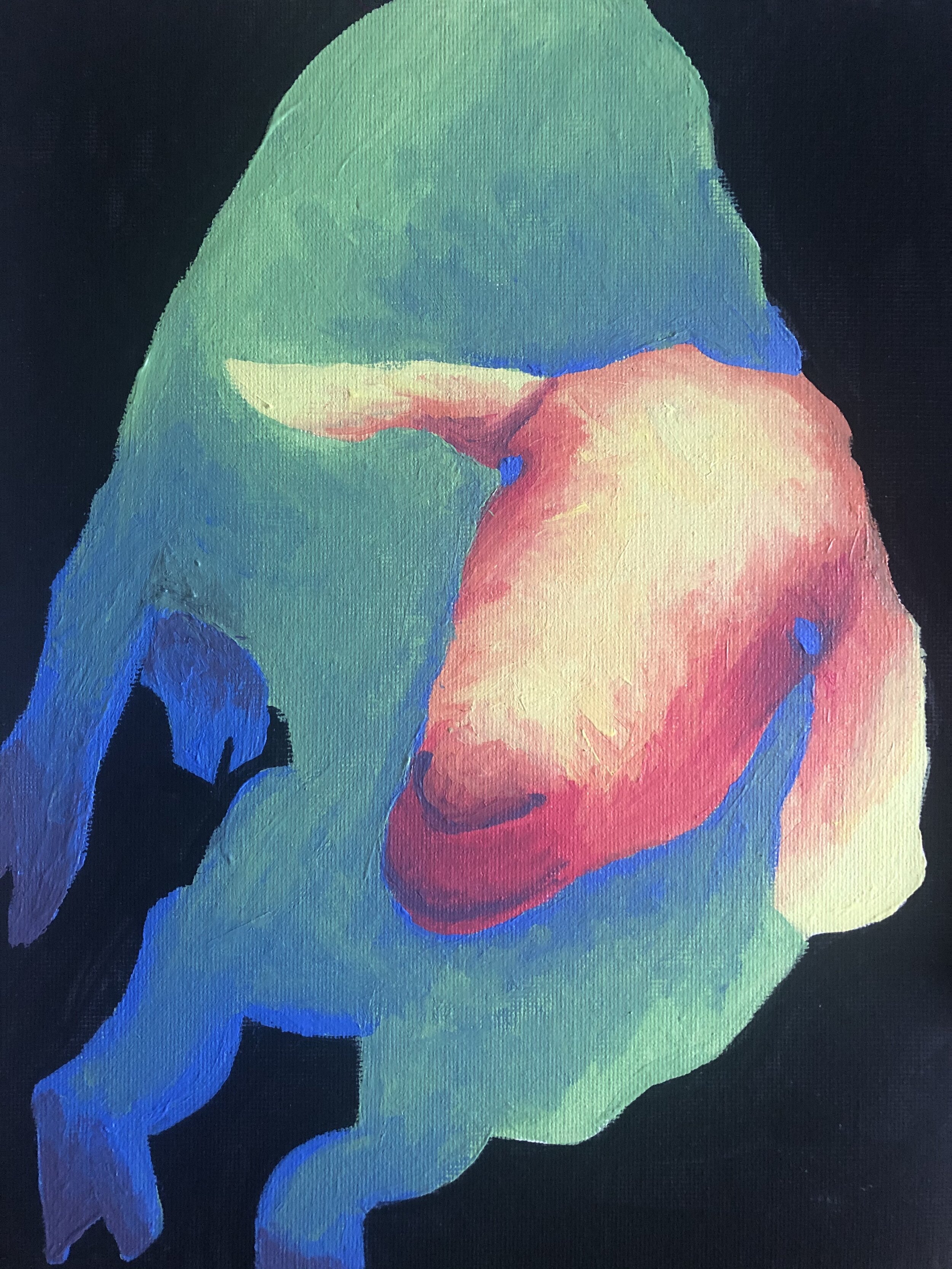
Exploring acrylics with kids & teens
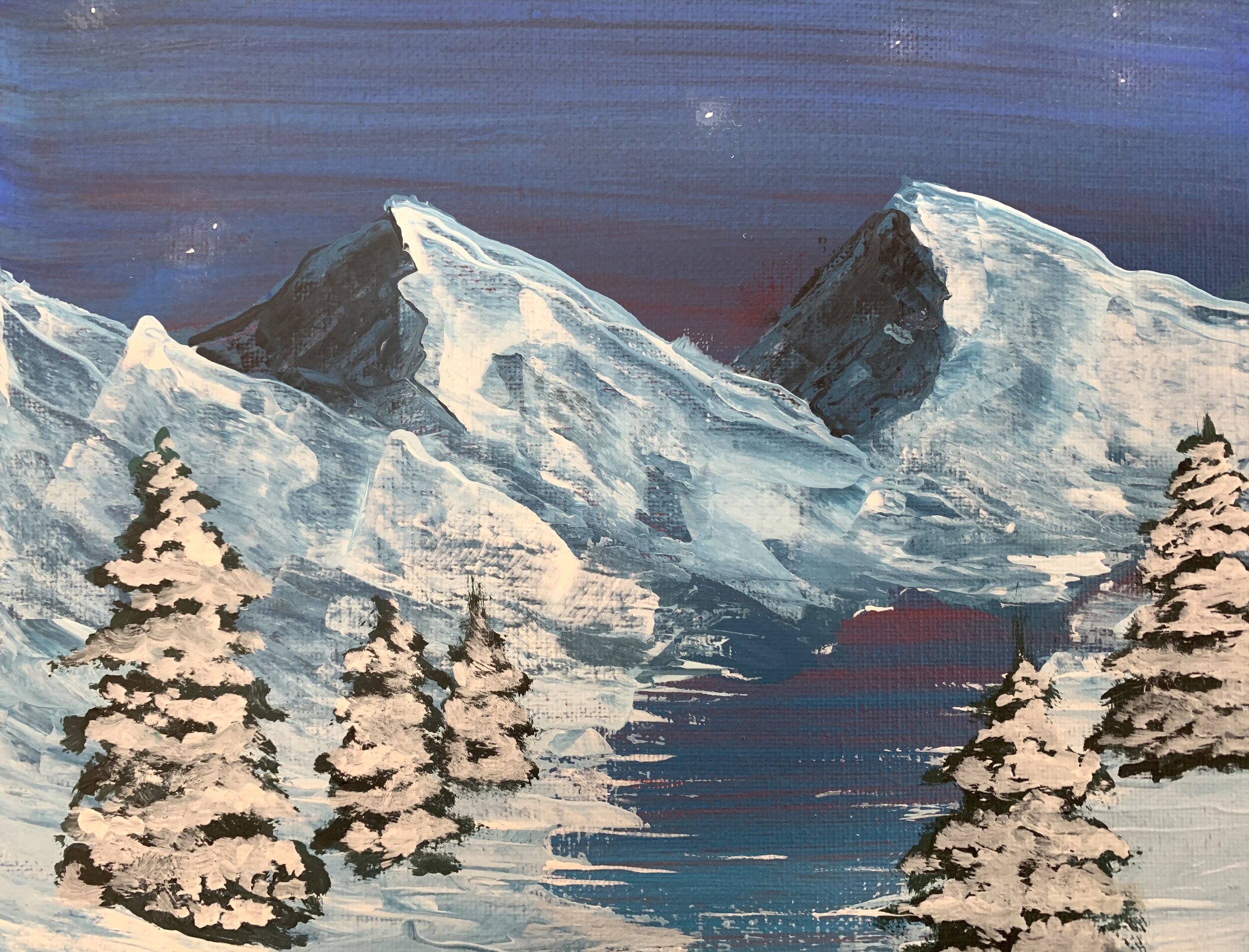
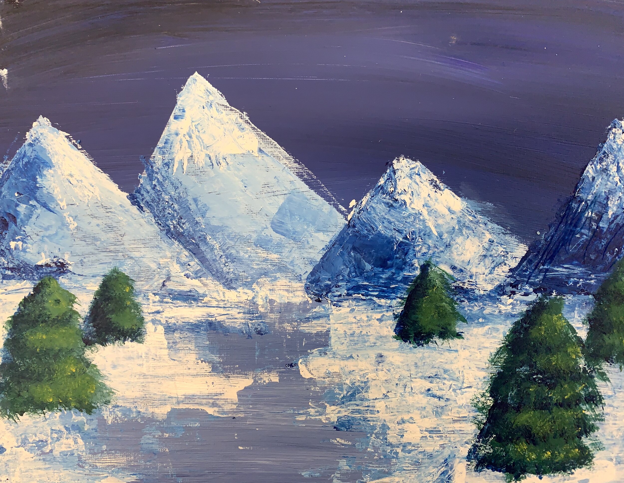
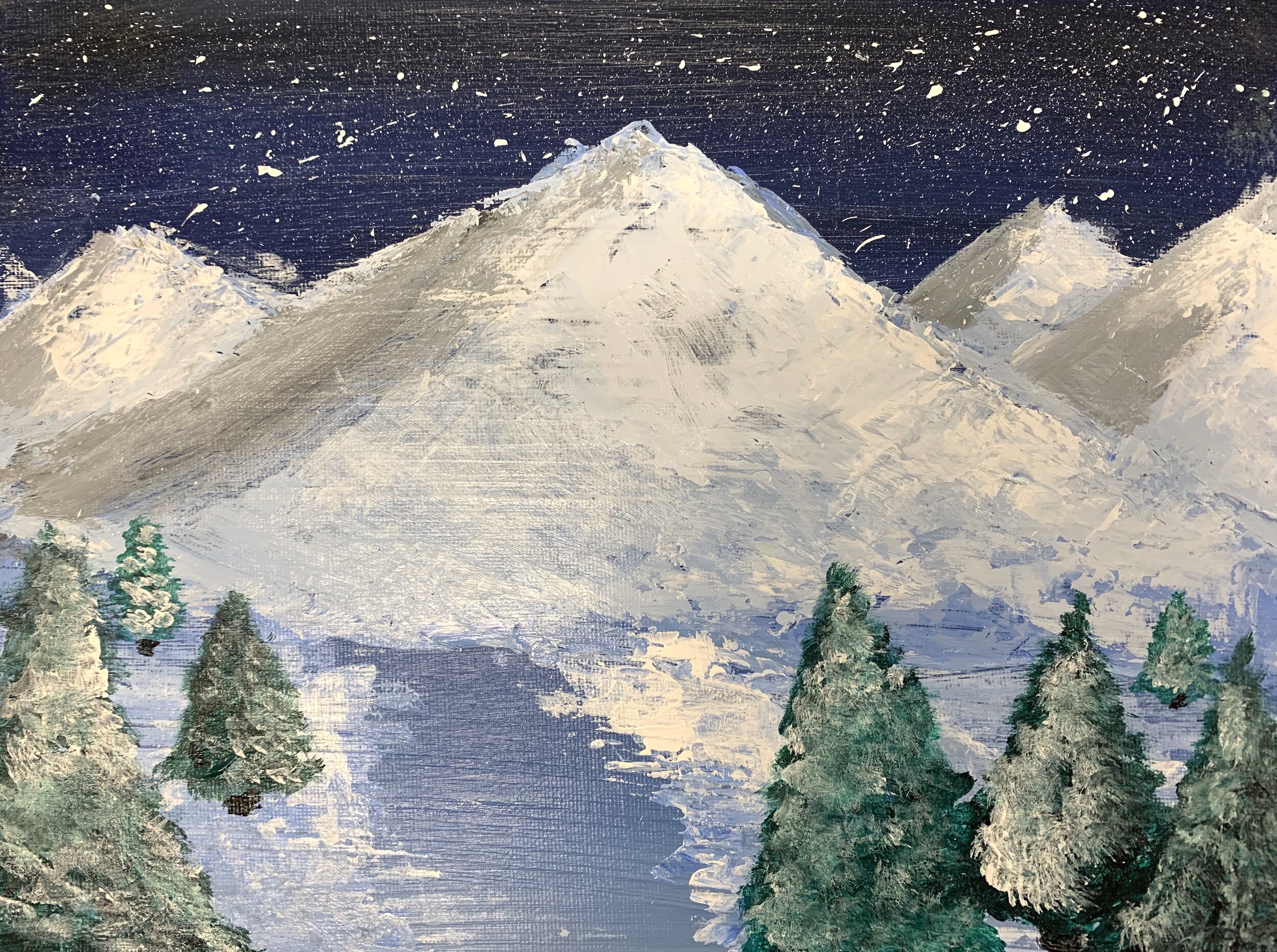
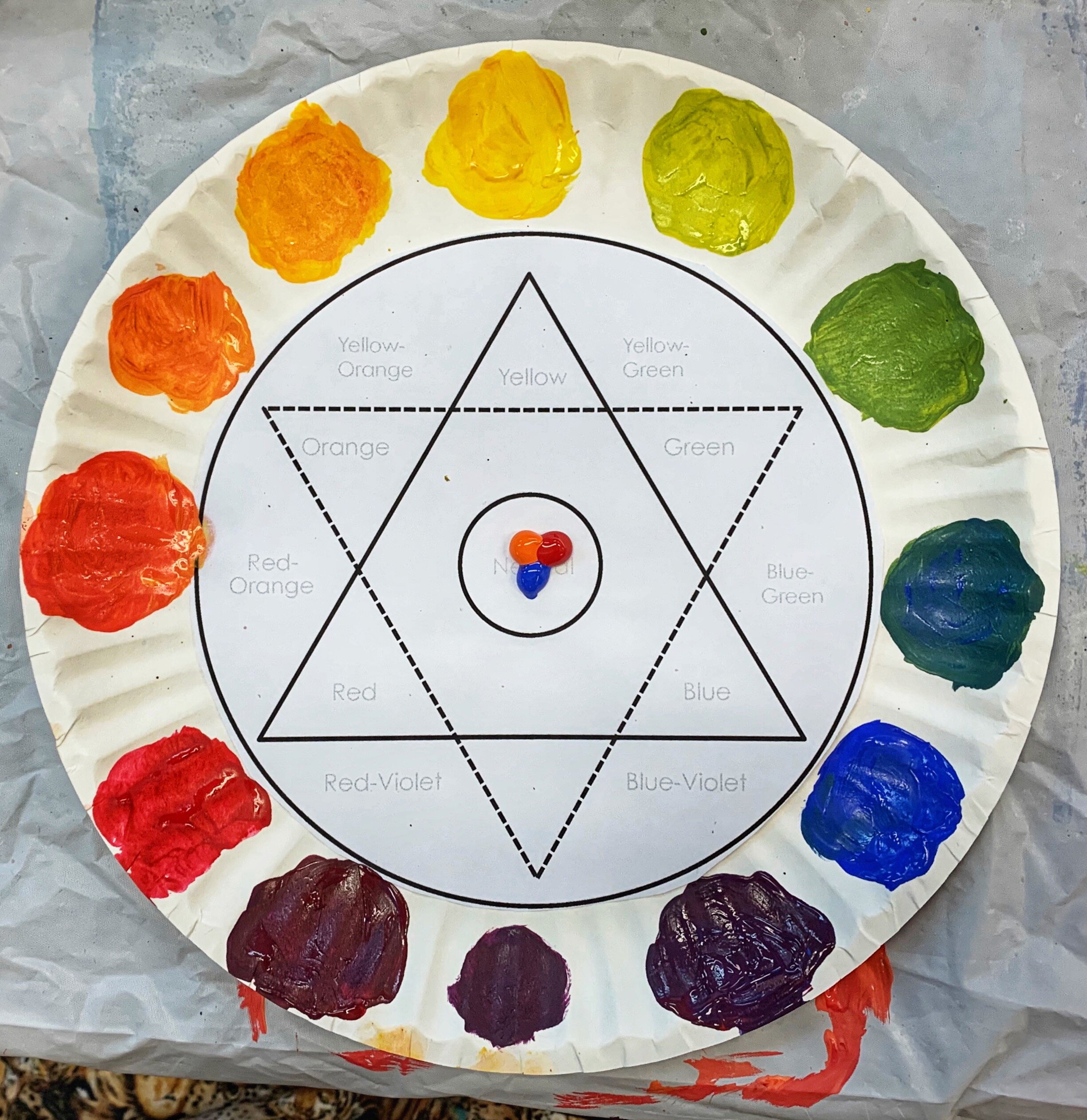
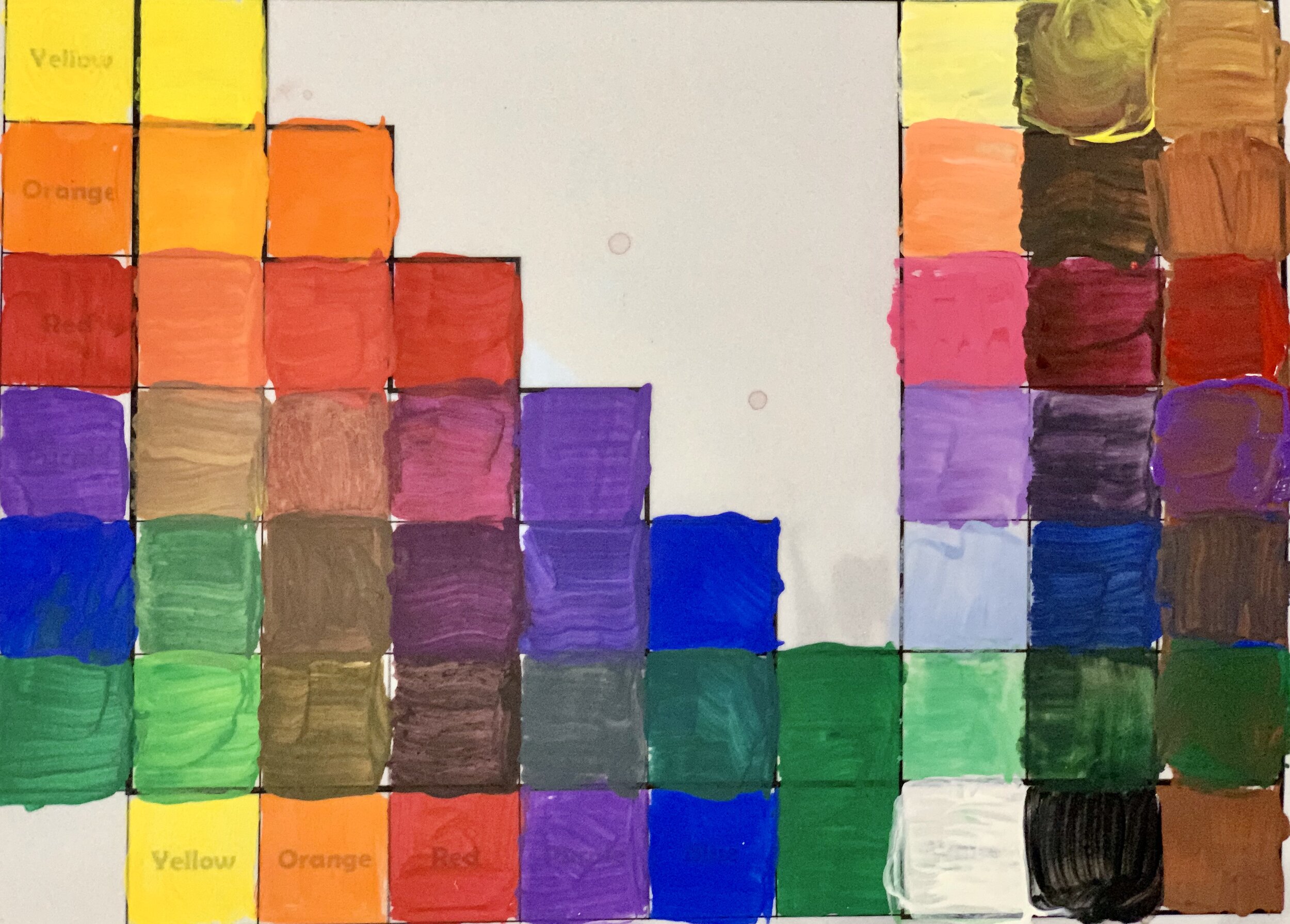
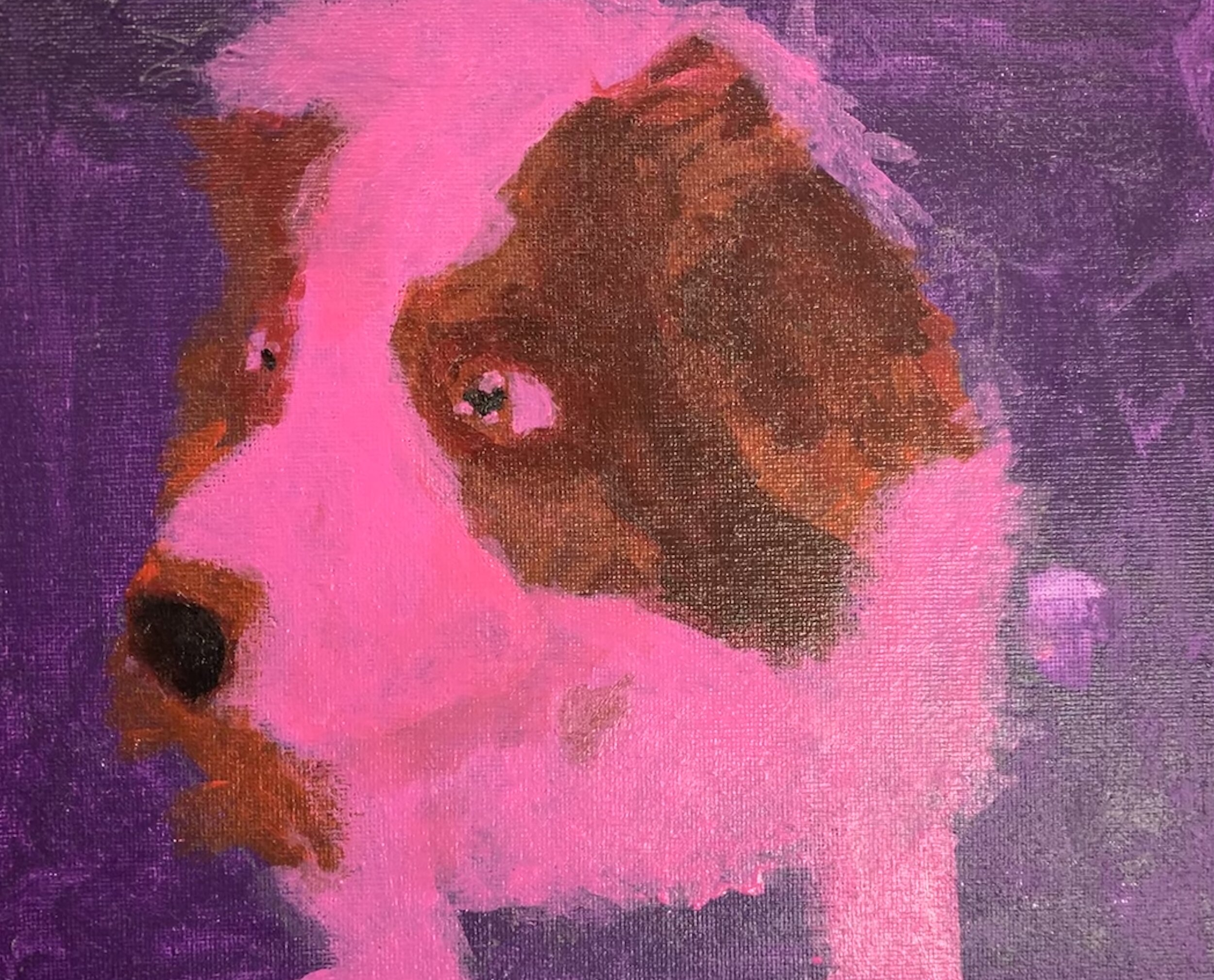
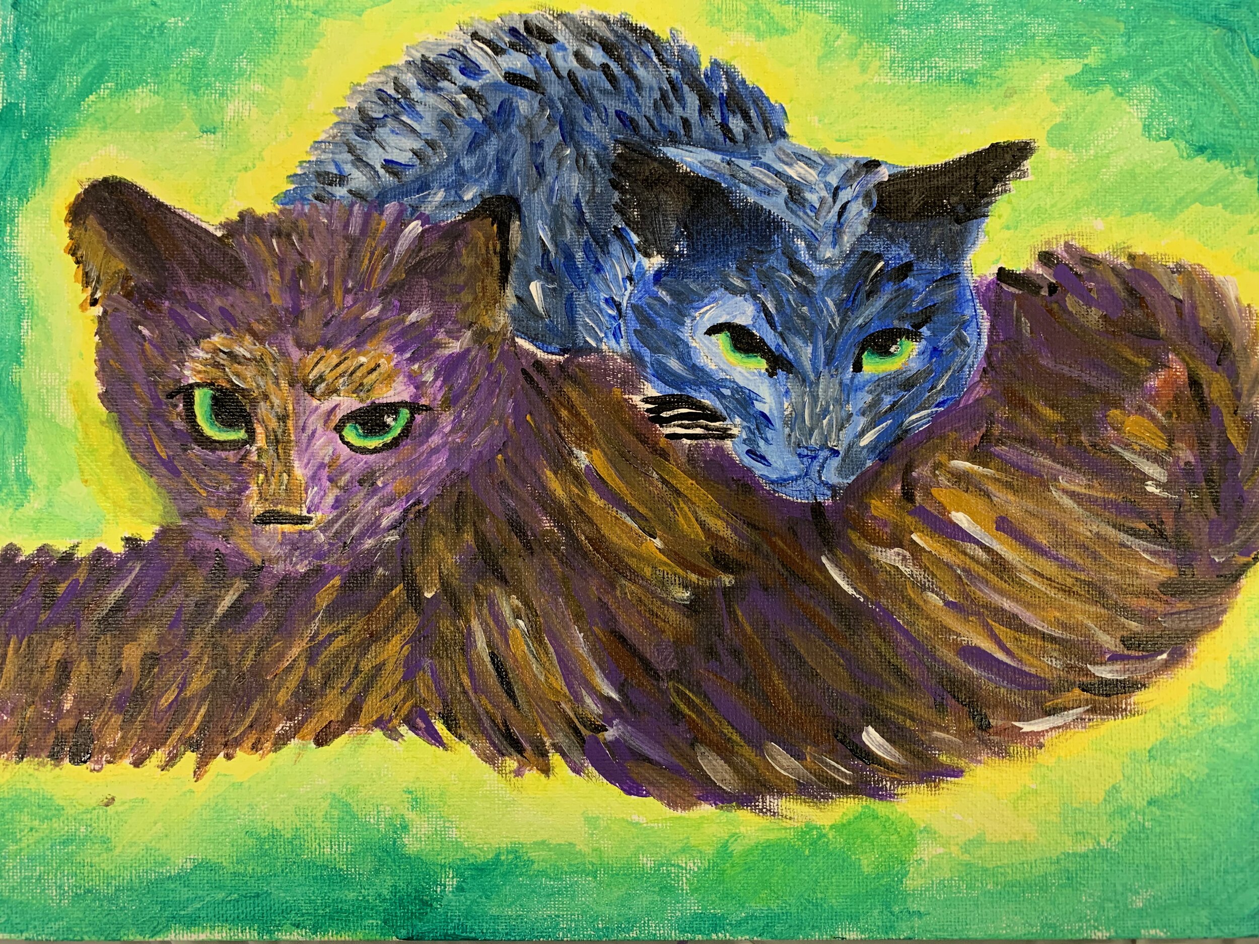
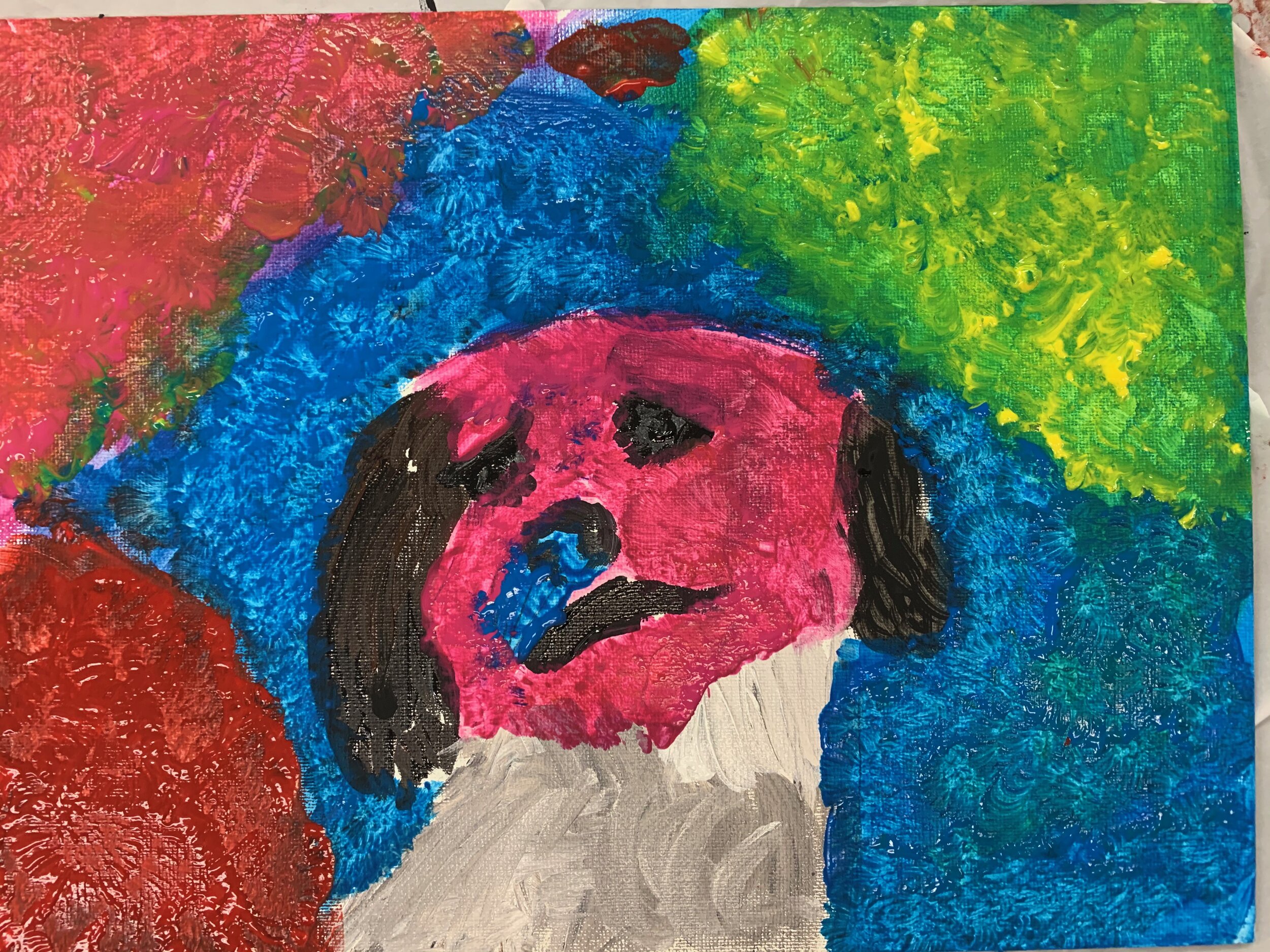
In January we explored painting with acrylics in both my 9 - 12 year olds class and my teens class. Here are some of the paintings we created as they learned about painting with a palette knife, blending, color theory, and paint consistency techniques.
Kids and teens learned how to mix colors from the primaries, learned about tints and shades, and made color matrixes.
They learned about subtly changing the values and hues to create the illusion of three dimensionality with blending techniques.
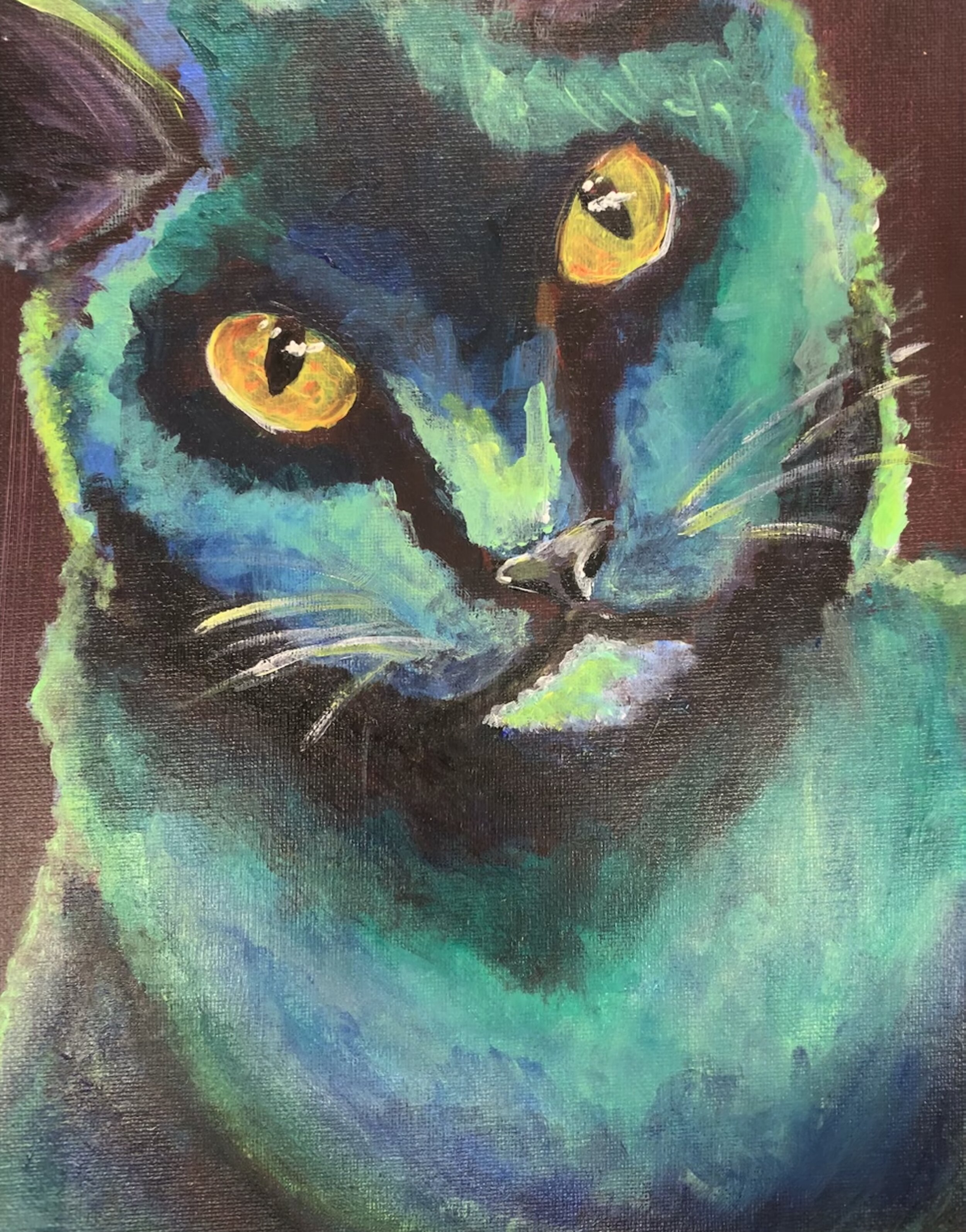
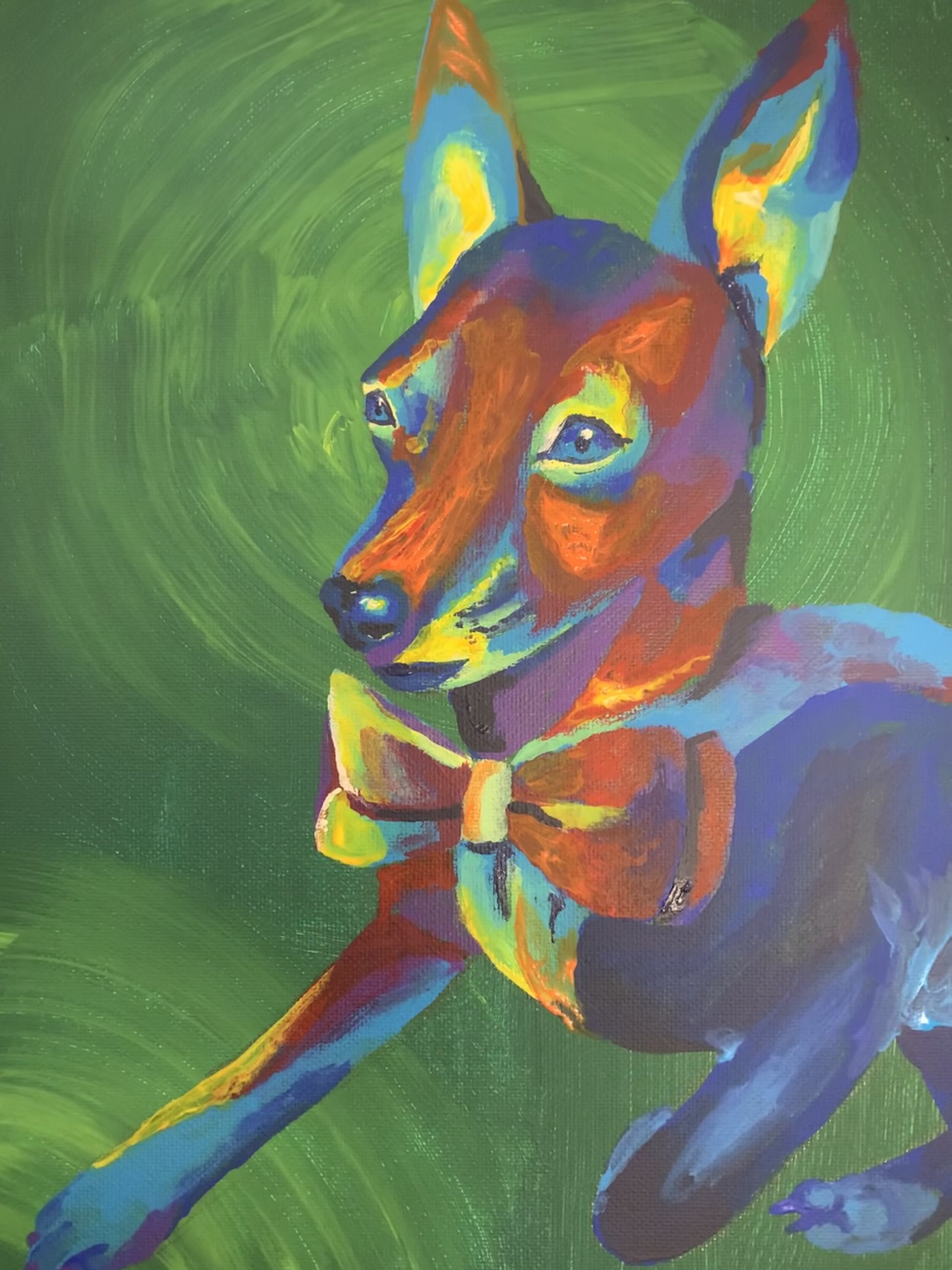
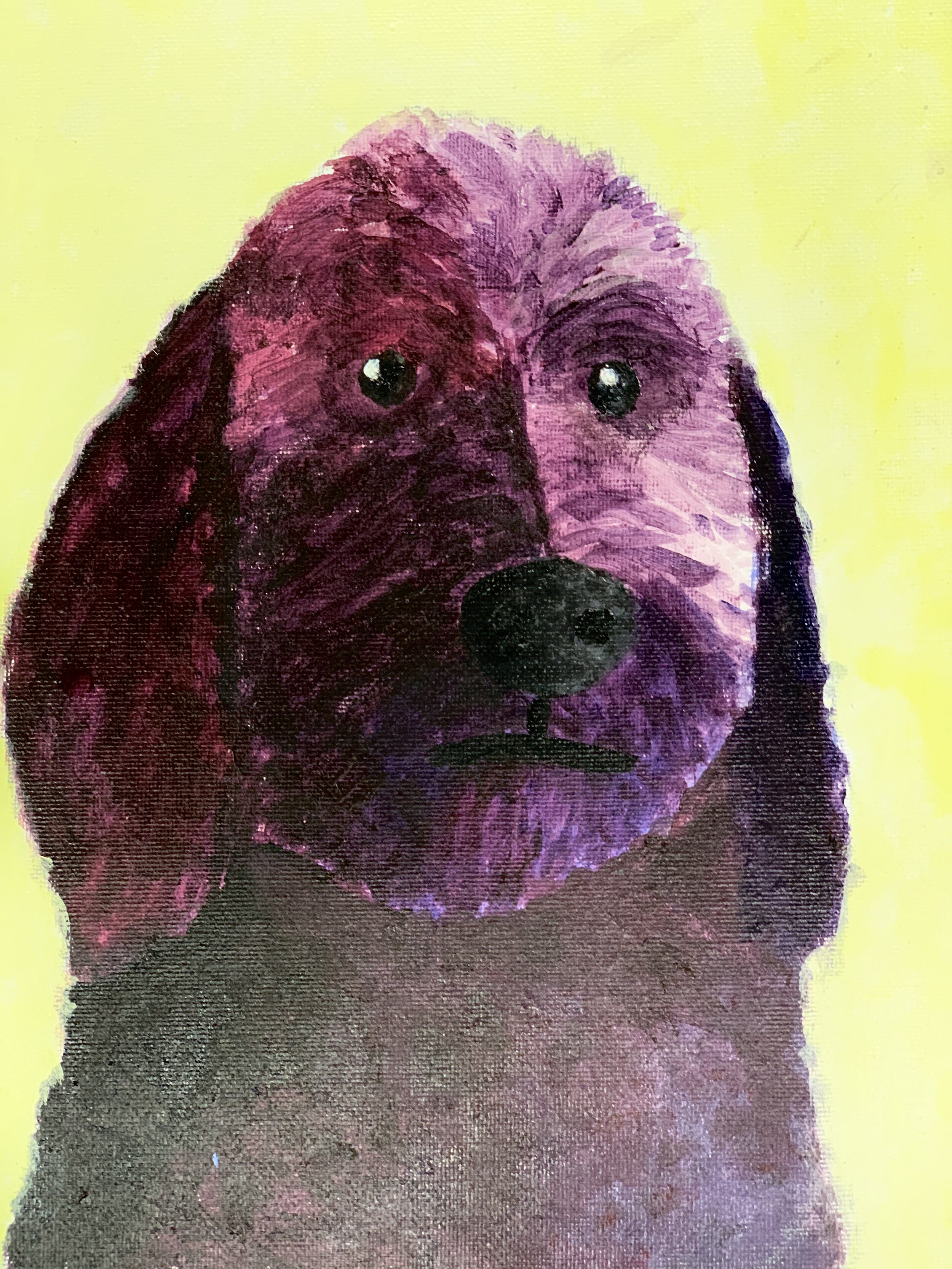
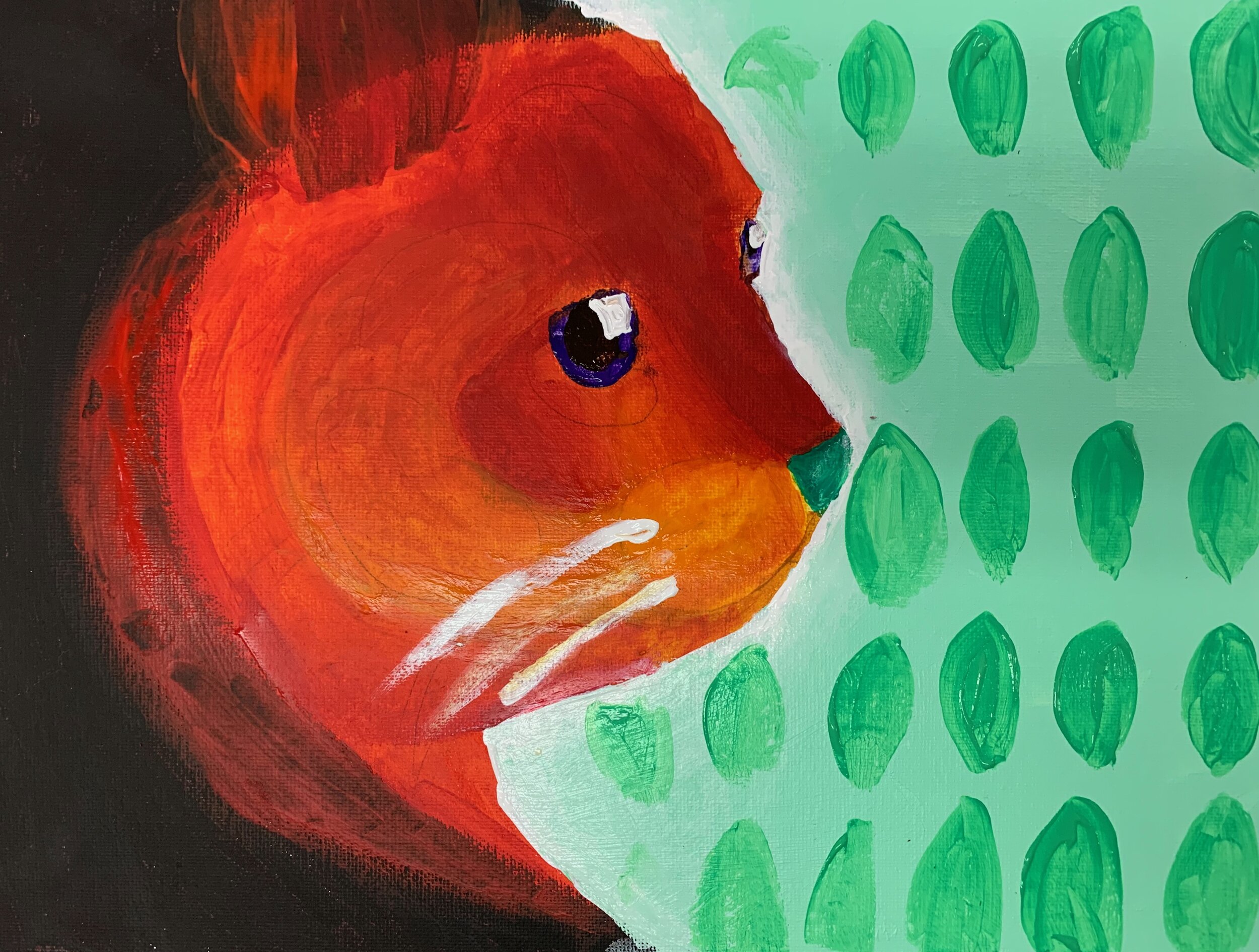
Our last project in our study of acrylic painting was a pet project. Parents emailed me photos of their pets which I printed out in black and white so artists would not be tempted to use the colors in the photographs. I had students draw the images as realistically as they could onto their canvas. They then studied various color schemes, especially looking at using colors that are not representational. Once they were happy with their color choices, they set to work painting their pet portraits.
Here are some of the pet portraits created by my young artists. Really fun and beautiful work!
Happy Valentine's!
I recognize how lucky I am to love what I do, to teach art, to be creative, and to share it all with the community at my art school, Cloud 9.
I am grateful for all the people that make up my art circle. Thank you all for the love fest!
A special thank you to our very own Debbie Wachel for creating this delightful stop motion animation. Debbie, you never cease to amaze us with your creativity, artistry and generosity. Thank you!!
Backyard Chronicles: Sketching Nature
I’ve always loved keeping a nature sketchbook. In the last few years these sketchbooks have become a way to explore my own backyard and learn more about my own environment. If the idea of sketching nature and learning more about your world appeals to you, this workshop is for you!
Backyard Chronicles: Sketching Nature
Located at Cloud 9 Art School
18414 103rd Ave NE
Bothell, WA 98011
www.cloud9artschool.com
Wednesdays 10:00am - 12:30pm
March 11 - April 15, 2020
$180
We will cover tips and techniques for drawing and watercolor painting a variety of trees, birds, flowers, animals in our backyards. Come explore the joy of keeping a nature sketchbook and learning all about the natural world you live in!
We will start out with basics, using reference photos, and going outdoors. We will study composition, how to pick subjects, how to draw, ink and watercolor. Most of all, we will explore our own backyards.
Whether permitting, we will head outside for some sketching too.
All skill levels welcome.
Designed to teach skills, give encouragement and create the environment needed to explore and develop our natural creativity with an emphasis on fine art skills. Focus on drawing, watercolor painting and keeping a sketchbook.
For suggested art supplies, click here.
Register at https://charlenecollinsfreeman.com/workshops
Watercolors for Beginners
I am excited to teach watercolor for beginners this spring. I love watercolors and it’s exciting to see people explore this magical medium for the first time, or for the first time in decades. I hope you will come and join me!
Watercolor for Beginners
Located at Cloud 9 Art School
18414 103rd Ave NE
Bothell WA 98011
www.cloud9artschool.com
Watercolor for Beginners
Located at Cloud 9 Art School
18414 103rd Ave NE
Bothell WA 98011
www.cloud9artschool.com
Saturdays 10am - 12:30pm
April 4 - May 9
Discover the magic of watercolor painting! Learn about watercolor paper, paints, brushes, and how to paint in a fun, nurturing atmosphere. Learn to see like an artist, develop basic drawing and brushstroke skills. Discover the value of light and shadow to add drama to your paintings!
Participate in creative exercises and build your skills to take your artwork to the next level.
Each of the lessons of our workshop will introduce new ideas and exercises, and techniques. You will get a creative workout, but in a relaxed, supportive setting, where experimentation and play are encouraged while techniques and observation are emphasized.
For suggested art supplies, click here. These are suggestions and you do not need all of these supplies. For our first class, feel free to bring any watercolor supplies you already have on hand and we will take it from there. Also, please buy this lovely book, Everyday Watercolor by Jenna Rainey.
All skill levels welcome.
For suggested art supplies, click here. These are suggestions and you do not need all of these supplies. For our first class, feel free to bring any watercolor supplies you already have on hand and we will take it from there.
Register at https://charlenecollinsfreeman.com/workshops
From ideas to finished paintings
So often we have great ideas for a painting but don’t know how to get it from our head onto our paper. Or we have vague ideas and don’t know how to flesh them out into strong, clear concepts that will translate well into finished paintings. If you agree, then my next workshop is for you!
Watercolors: from ideas to finished paintings
$295
Located at Cloud 9 Art School
18414 103rd Ave NE
Bothell WA 98011
www.cloud9artschool.com
Tuesdays 10am - 12:30pm
March 10 - May 12, 2020
Explore the magic of watercolor painting while learning to see like an artist and developing your ideas into finished paintings!
I will provide step by step instruction for our first paintings, exploring composition, drawing, and color choices. We will discover the value of light and shadow to add drama to our paintings and learn how to push our art to the next level!
Then students will be encouraged to bring in their own photographs or sketches to create their own unique paintings with my guidance. Ideas for paintings can follow a theme or students can create paintings that are completely different from one another in both subject and style. By the end of this workshop, students will have a number of finished paintings and the confidence to paint what they please, from idea to finished piece!
You will get a creative workout, but in a relaxed, supportive setting.
For suggested art supplies, click here. These are suggestions and you do not need all of these supplies. For our first class, feel free to bring any watercolor supplies you already have on hand and we will take it from there.
All skill levels welcome.
Register at https://charlenecollinsfreeman.com/workshops
Next Steps in Watercolors
I am offering Next Steps in Watercolors as a 6 Week Workshop for Adults & Teens who have had some experience watercolor painting.
Next Steps in Watercolors
Located at Cloud 9 Art School
18414 103rd Ave NE
Bothell WA 98011
www.cloud9artschool.com
Saturdays 1:30m - 4pm
February 1 - March 7
This class continues the exploration of watercolors that started in the Watercolors for Beginners workshop. You do not have to have taken that workshop to participate in this workshop.
Discover the magic of watercolor painting! Learn about watercolor paper, paints, brushes, and how to paint in a fun, nurturing atmosphere. Learn to see like an artist, develop basic drawing and brushstroke skills. Discover the value of light and shadow to add drama to your paintings!
Participate in creative exercises and build your skills to take your artwork to the next level.
Each of the lessons of our workshop will introduce new ideas and exercises, and techniques. You will get a creative workout, but in a relaxed, supportive setting, where experimentation and play are encouraged while techniques and observation are emphasized.
For suggested art supplies, click here. These are suggestions and you do not need all of these supplies. For our first class, feel free to bring any watercolor supplies you already have on hand and we will take it from there. Also, please buy this lovely book, Everyday Watercolor by Jenna Rainey.
All skill levels welcome.
Register at https://charlenecollinsfreeman.com/workshops
You're invited!
I am happy to announce that I have a solo exhibit coming up at Bothell’s Tsuga Fine Art Gallery!
Please join me for the opening reception!
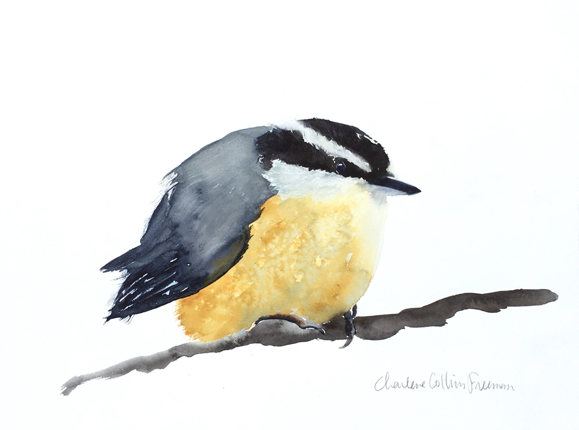
Birds & Botanicals Watercolors by Charlene Collins Freeman
January 28 - March 14, 2020 at Tsuga Fine Art
Opening Reception January 30 5pm - 8pm
Tsuga Fine Art & Framing announces a solo exhibition of watercolors by local teaching artist Charlene Collins Freeman (www.charlenecollinsfreeman.com). Please join the Charlene for the opening reception of "Birds & Botanicals" at Tsuga, a new series of watercolors and explorations into the beauty of our natural world.
Tsuga Fine Art
10101 Main Street
Bothell, Washington 98011
Tsuga Fine Art & Framing announces a solo exhibit of watercolors by CHARLENE COLLINS FREEMAN (www.charlenecollinsfreeman.com)
Hope to see you there!
Season's Greetings!
My talented friend and fellow art instructor, Debbie Wachel, created this delightful stop motion animation for my art school, Cloud 9 Art School. I absolutely had to share it with you because it is so charming and heartfelt.
Enjoy!
Keeping a Sketchbook Journal
Sketchbooks can be an exciting investigation into art techniques and ideas but even more so, a wonderful way to record your life. A sketchbook can have many roles in an artist’s practice but mostly, I hope to encourage you to use sketchbooking as a way to be creative every day.
A visual journal is a place where you explore techniques and materials while recording the world around you.
It is for nobody else’s eyes but your own, unless you choose to share. No matter what your level of experience is, give your inner artist a little breathing room by developing a non judgmental sketchbook practice.
Pages can be beautiful in their simplicity or take on the aesthetic of a polished piece. And it can be one way on one page and then another way on the next. Don’t box yourself in. The point of your sketchbook is above all to create and record your thoughts, your feelings, your life!
You can be flowery or decorative on one page and not on the next. You do not need to spend time adding borders; sweating over details, double guessing what you should write about, working over pages again and again. The sketchbook is NOT meant to be a complete book of finished artworks and illustrations; it is meant to be creative document of exploration and recording what is important to you at the moment.
Come join me for:
Keeping a Sketchbook Journal
Located at Cloud 9 Art School
18414 103rd Ave NE
Bothell WA 98011
www.cloud9artschool.com
Saturdays 10:30am - 12:30pm
February 1 - March 7
We will learn about drawing, ink and watercolor while exploring various approaches to keeping a sketchbook journal. A place where, as an artist, you get to think, works things out, learn and just create frequently, even daily, without pressure.
All skill levels welcome.
Register by clicking here.
For suggested art supplies, click here.
Bob Ross Party for the Holidays
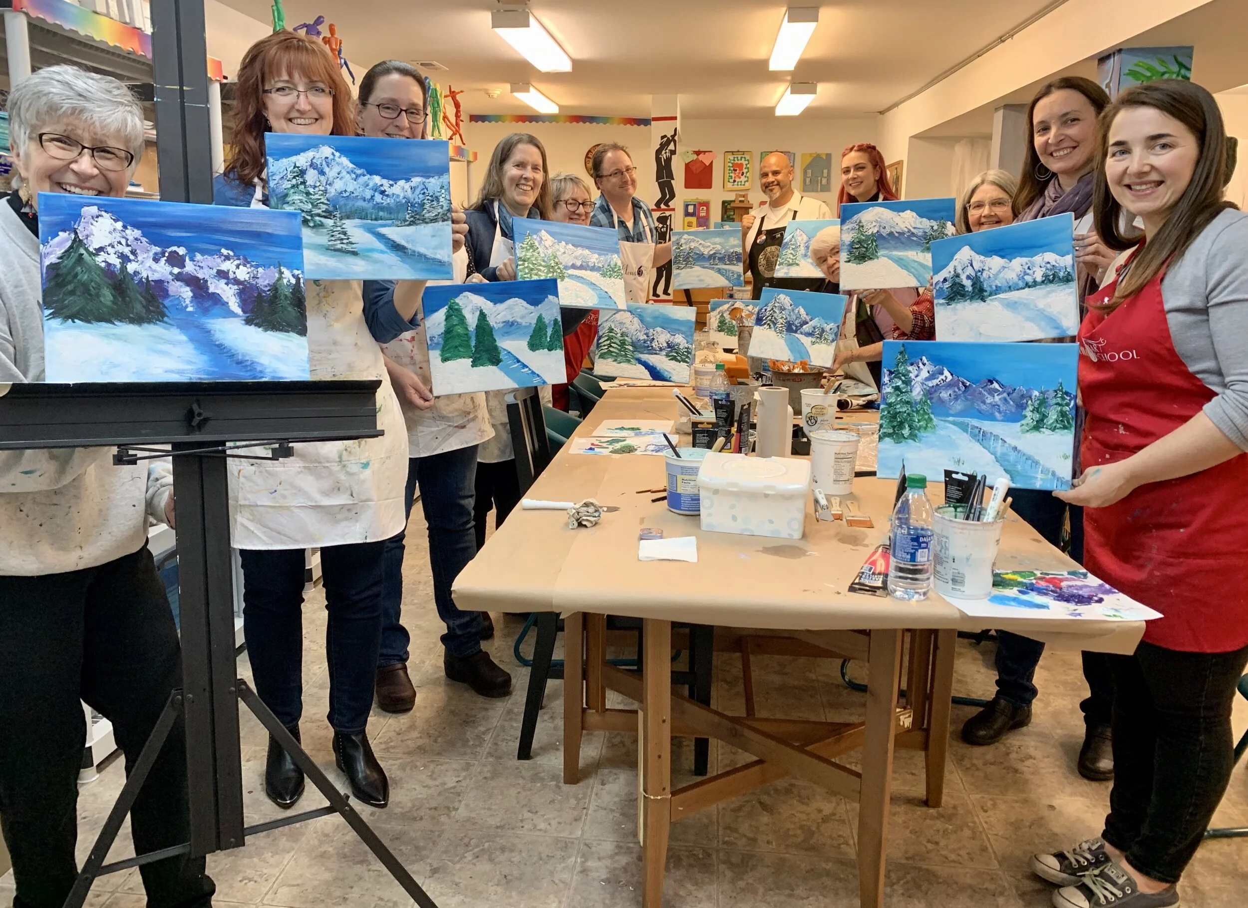
Last night we had the third annual holiday party for Cloud 9 instructors. It’s hard to believe that it’s already our third year. Seems like just a few months ago that I opened up the doors to Cloud 9 Art School.
We hired Che Lopez to lead us through a Bob Ross style painting. It was such fun! A studio full of teachers out of their depth really. I’m so proud of the school and grateful for the teachers who make it what it is: a joyful, interesting, exciting place to learn and play and create.
Thank you to all the Cloud 9 instructors who have joined me on this adventure and happy holidays to all!
Understanding Color: Intensity
Colors have several properties to explore: hue, value, intensity, and temperature.
Intensity (also referred to as saturation or chroma) refers to the degree of purity of a color. A highly intense color is bright and a low-intensity color is more neutral or muted. Colors are at their purist when they are straight out of the tube, not mixed with another color. As soon as you mix in another color, you have lowered the intensity of both colors mixed.
Learning how to vary the intensity of a color gives you control over color choices and creates beautiful color effects.
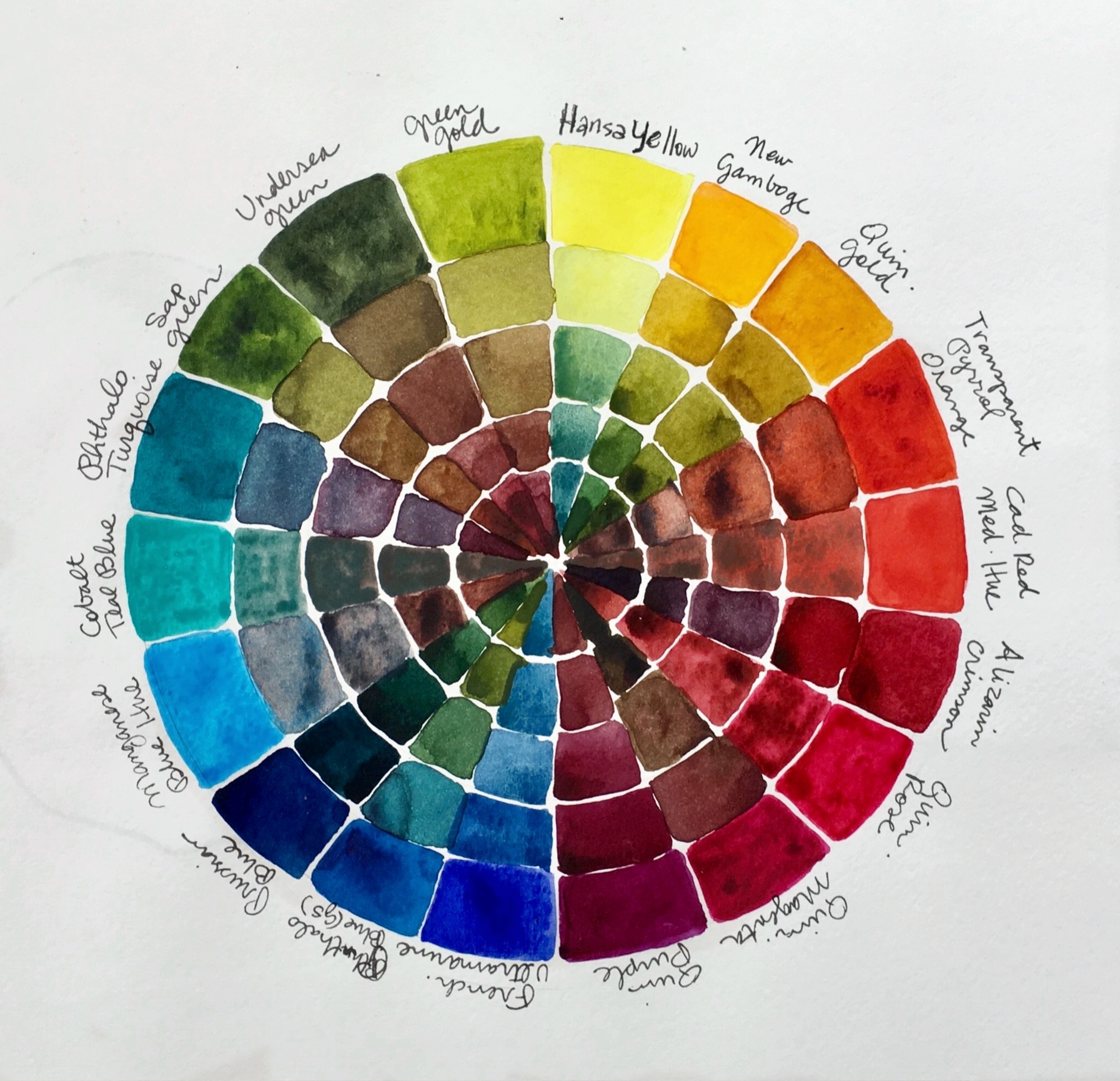
A color’s intensity always diminishes when it gets mixed with another color. The farther apart on the color wheel the two colors you are mixing are, the more the intensity of both color is diminished. Ultimately, mixing two colors that are completely opposite each other on the color wheel (complementary colors) creates the least intense (most neutral) mix.
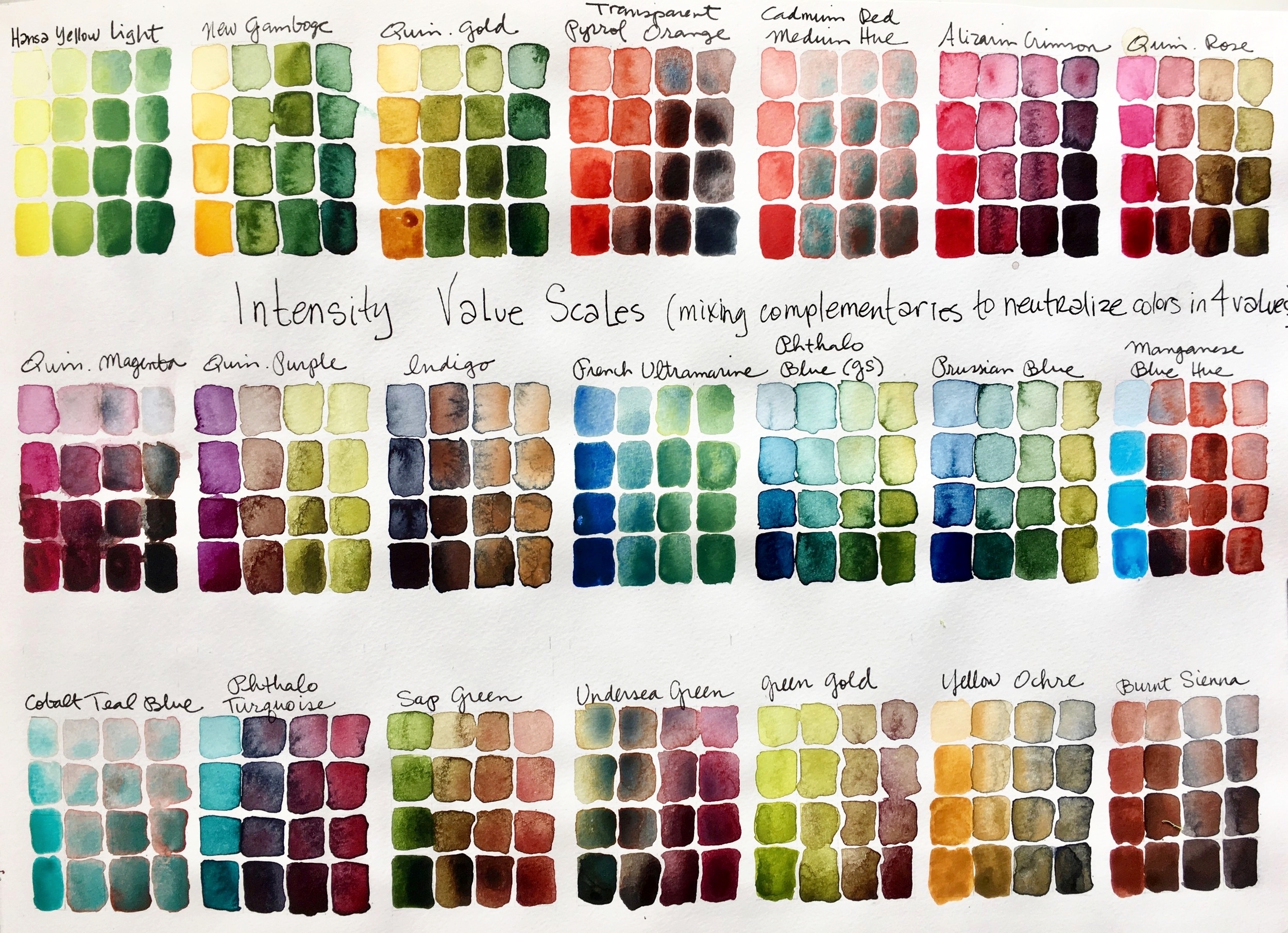
To better understand these ideas, make an intensity color wheel study like the one pictured above. The swatches are made by mixing complimentary colors. On one end, have a pure color, unmixed, Then slowly add it’s complement to it to see the desaturation. Add more and more of the complement until you end up on the other end with just the pure complementary color. In the middle, you will find that you’ve created neutral mixes of all your colors.
Neutrals are muted down versions of the colors you are mixing. The term neutral color also applies to colors such as blacks, greys and whites.
In theory, a neutral color is a color which is neither warm nor cool. Such colors result from the combination of two complementary colors (such as, red and green, blue and orange, and yellow and purple). But you can push neutrals towards warm or cool by adding more of the cool or more of the warm color you are using.
Another great exercise is an Intensity & Value Scale chart for each color you have. Pick a color and make four squares of value with it from top to bottom on the left hand side of your page. To make four square of value, you just add a bit of water to your paint to get a lighter value.
Next, add enough complementary color to it to get a light gray and paint in the four boxes next to the ones of pure pigment you already painted. Each box should darken in value as you go down the scale. Make a third mixture with even more of the complementary color in it and paint the four squares from lightest to darkest top to bottom. Then paint your last row which will have a lot more of the complementary color in it. Again paint that mix in four values.
You will end up with a good sense of each color’s intensity and value range. And you will have a beautiful page of color mixes!
You can also lower a color’s intensity by mixing in grays, earth tones, and darks. Some colors are naturally highly intense (like Opera Pink) while others are low intensity colors (such as Yellow Ochre).
Neutrals, less intense mixes, are often the most beautiful colors. Get friendly with them!
I am offering the workshop Understanding Colors for the Watercolorist, to start in January! It will be held at Cloud 9 Art School in Bothell.
Wednesdays 10am- 12:30pm
January 8 - February 26, 2020
Designed to help watercolor artists understand both color theory and paint properties, we will explore the properties of watercolor pigments (transparent, opaque, staining, fugitive, granulating, on my!) and we will look at different ways of mixing color (on the palette, on the paper, wet-into-wet, glazing). We will experiment with color temperature, value, and intensity of pigments. We will learn about the advantages of painting with a limited palette and we will make a lot of color charts in the process.
We will play with formulas that work well for specific subjects (skies, skin, shadows). We will explore how to match colors and study classic compatible palettes (colors that work well together in a painting). We will look at the emotions of colors and explore the use of color through art history.
Each of the lessons of our workshop will introduce new ideas and exercises, new paints, techniques, and challenge you to think about color in new ways. You will get a creative workout, but in a relaxed, supportive setting, where experimentation and play are encouraged while techniques and observation are emphasized.
For more information and to register please visit
www.charlenecollinsfreeman.com/workshops/
Color in a picture is like enthusiasm in life. - Vincent van Gogh
Understanding Color: Temperature
Temperature refers to the warmth or coolness of a color. A color’s temperature affects the color of everything we see. And as artists, it’s important to learn about it because color temperature helps us create depth, mood and even movement. In general, yellows, oranges, and reds are warm colors and blues and greens are cool.
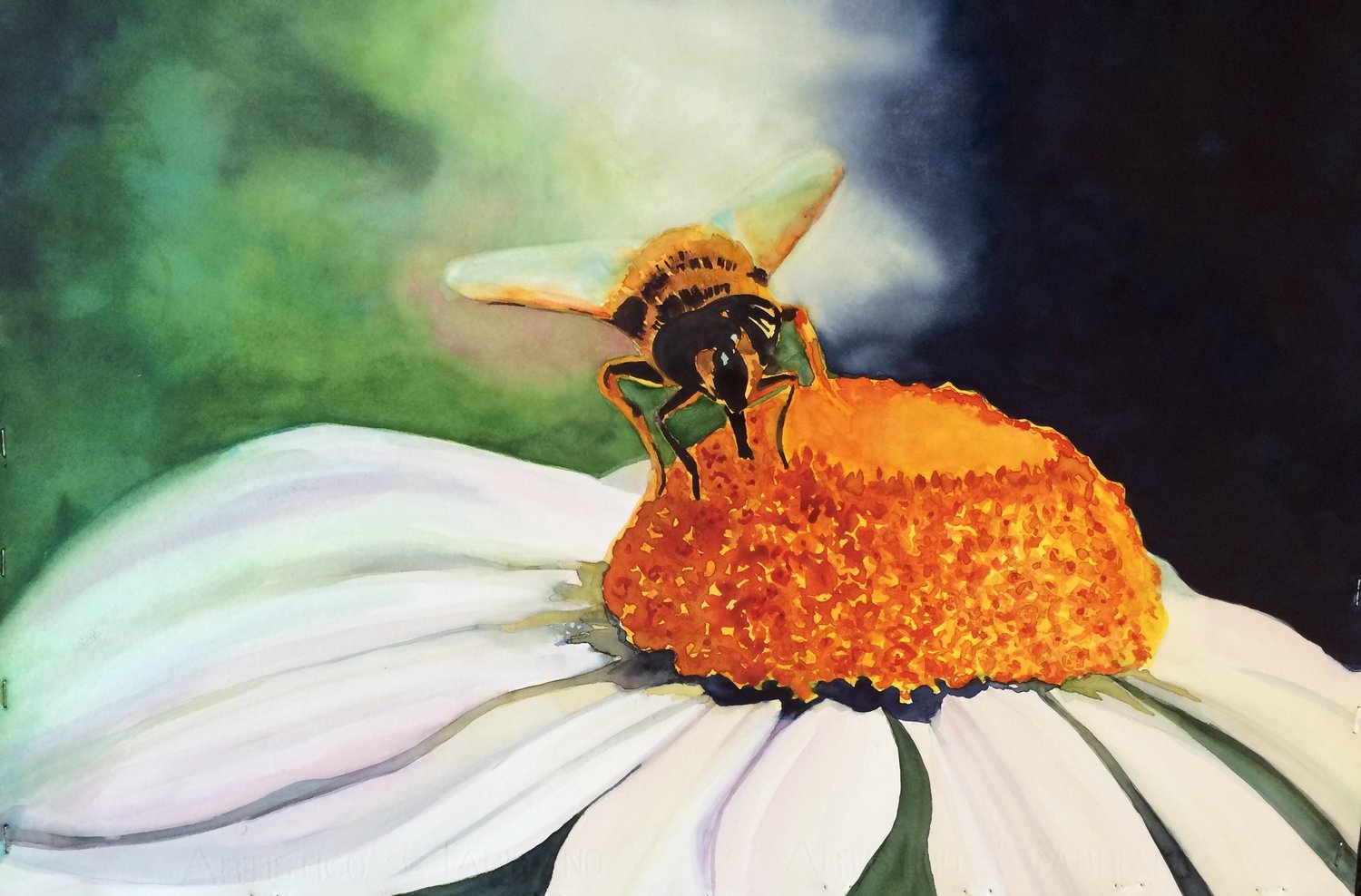
Warm colors appear to advance, or come forward, while cool colors appear to recede or go back in space. This is because the wavelengths of warm colors are longer so your eyes see them sooner than the shorter wavelengths of cooler colors. Using warm colors in the foreground of a painting and cool colors in the background of a painting can help create the illusion of three dimension and distance, such as in my painting below. The daisy and bee seem to come forward in their warm tones, while the background, all cool tones, seems to recede.
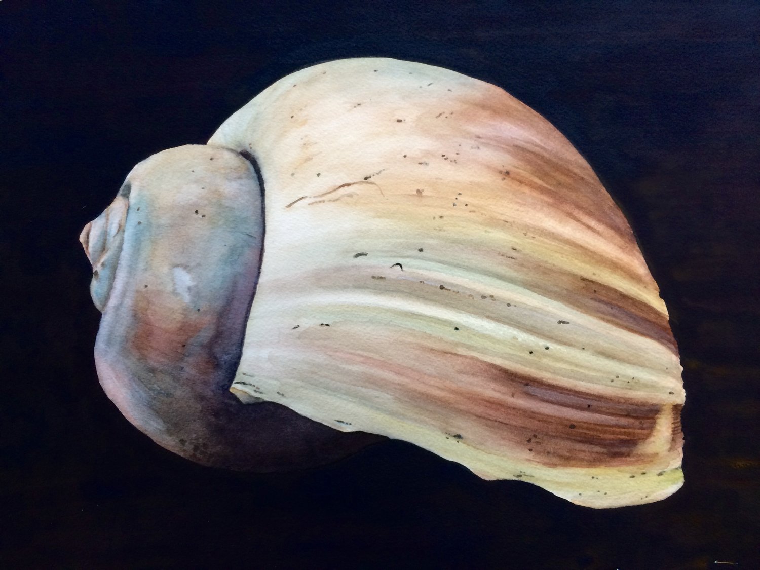
The illusion of advancing or receding helps create a sense of form in smaller subjects, not just landscapes. For example, in this watercolor of a shell, the bigger shape of the shell is warm (yellows and reddish browns) and comes forward, while I painted the smaller shape of the shell cool (blue) and it appears to be further back than the warm shape of the shell.
Generally when the light source is warm, the shadows will be cool. When the light source is cool, the shadows will be warm.
Creating warm/cool contrasts can also add a wow factor at your focal point. This watercolor I painted of a candy display plays with temperature contrasts and it has a dazzling effect.
Looking at the color wheel, red-orange is the warmest color. When you move away from it in either direction, the colors will appear cooler and cooler, until you get to blue-green, which is the coolest color. As you move away from blue-green in either direction, the colors will appear to get warmer and warmer, until you are back to red-orange again. That sounds simple. But…
Color temperature is relative. A color that might appear warm next to one color, could appear cool next to a different color. Also, every color has a tendency towards either warm or cool. We say yellow is a warm color, but some yellows tend towards red (so you will see warmer tones in it) while others tend towards blue (which are cooler tones).
For example:
Rose Madder Genuine and Alizarin Crimson are cool reds. Cadmium Red and Light Red are warm reds, because they lean more toward yellow. Aureolin Yellow is slightly cool when compared with Cadmium Yellow. French Ultramarine is a warm blue. Cobalt Blue is slightly cool.
And neutral colors and earth tones, while typically appearing cooler because they are low intensity, still have differences in color temperature from one to the next.
The more we start to see these nuances in color temperature the better we will be at mixing colors as well since to create brilliant color you should mix colors that lean towards the same temperature.
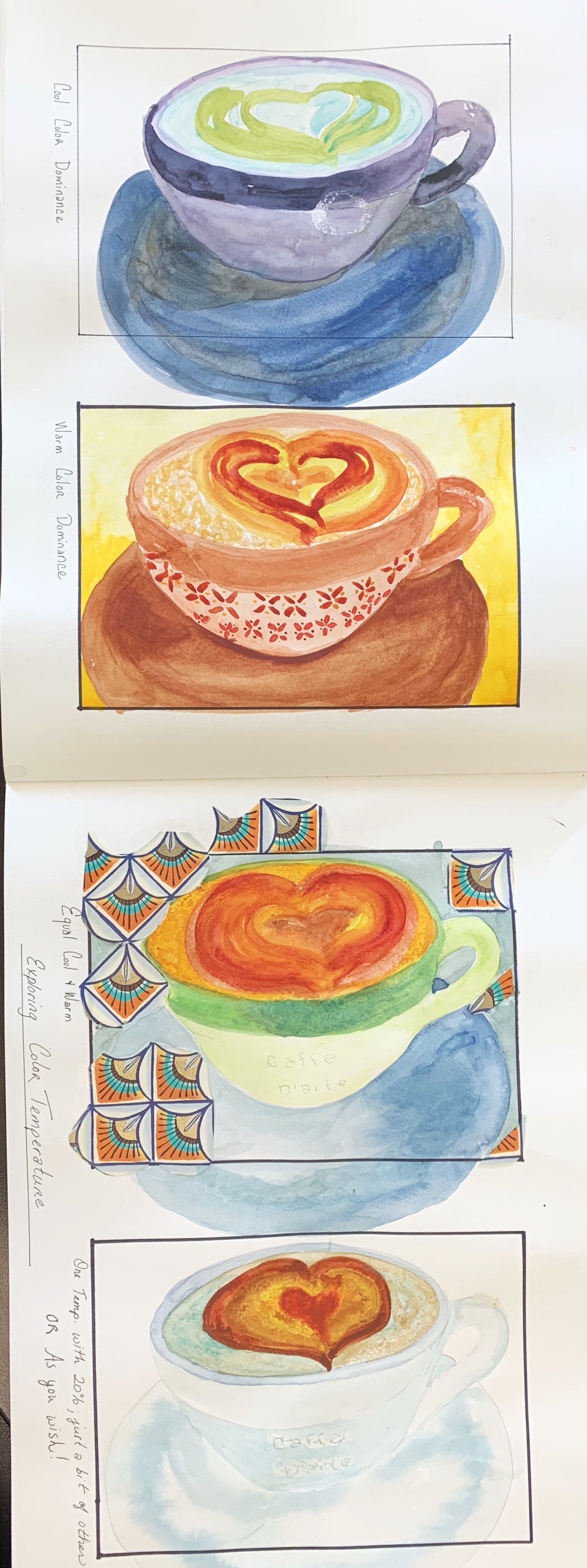
It’s also important to aim for a temperature dominance in your paintings. Avoid equal amounts of cools and warm colors as it creates an unappealing result. It's fine to have both warm and cool colors in your artwork, but not in equal amounts. Choose whether the dominant temperature will be warm and cool and be sure you use more of those colors.
Seeing temperature in color takes practice. Here's an exercise to get you started.
Sketch the same scene four times.
In the first version, paint it using only cool colors.
In the second version, paint it using only warm colors.
In the third, paint predominately in one temperature with just a bit of the other temperature.
In the fourth version, paint it roughly half cool colors and half warm colors.
Study the differences in mood, sense of depth, interest, personal preference. You are on your way to understanding color temperature!
I am offering the workshop Understanding Colors for the Watercolorist, to start in January! It will be held at Cloud 9 Art School in Bothell.
Wednesdays 10am- 12:30pm
January 8 - February 26, 2020
Designed to help watercolor artists understand both color theory and paint properties, we will explore the properties of watercolor pigments (transparent, opaque, staining, fugitive, granulating, on my!) and we will look at different ways of mixing color (on the palette, on the paper, wet-into-wet, glazing). We will experiment with color temperature, value, and intensity of pigments. We will learn about the advantages of painting with a limited palette and we will make a lot of color charts in the process.
We will play with formulas that work well for specific subjects (skies, skin, shadows). We will explore how to match colors and study classic compatible palettes (colors that work well together in a painting). We will look at the emotions of colors and explore the use of color through art history.
Each of the lessons of our workshop will introduce new ideas and exercises, new paints, techniques, and challenge you to think about color in new ways. You will get a creative workout, but in a relaxed, supportive setting, where experimentation and play are encouraged while techniques and observation are emphasized.
For more information and to register please visit
www.charlenecollinsfreeman.com/workshops/
Color in a picture is like enthusiasm in life. - Vincent van Gogh
Understanding color temperature
Student artwork: Judy Kennedy
Temperature refers to the warmth or coolness of a color. As artists, it’s important to learn about it because color temperature helps us create depth, mood, color harmony, and even movement.
In general, yellows, oranges, and reds are warm colors and blues and greens are cool. That sounds simple but color temperature is relative. A color that might appear warm next to one color, could appear cool next to a different color. Also, every color has a tendency towards either warm or cool. We say yellow is a warm color, but some yellows tend towards red (so you will see warmer tones in it) while others tend towards blue (which are cooler tones).
Neutral colors and earth tones, while typically appearing cooler because they are low intensity, still have differences in color temperature from one to the next.
Warm colors appear to advance, or come forward, while cool colors appear to recede or go back in space. This is because the wavelengths of warm colors are longer so your eyes see them sooner than the shorter wavelengths of cooler colors. Using warm colors in the foreground of a painting and cool colors in the background of a painting can help create the illusion of three dimension and distance. The illusion of advancing or receding helps create a sense of form in smaller subjects too, not just landscapes.
The more we start to see these nuances in color temperature the better we will be at mixing colors as well since to create brilliant color you should mix colors that lean towards the same temperature.
It’s important to aim for a temperature dominance in your paintings. Avoid equal amounts of cools and warm colors as it creates an unappealing result. It's fine to have both warm and cool colors in your artwork, but not in equal amounts. Choose whether the dominant temperature will be warm and cool and be sure you use more of those colors.
Seeing temperature in color takes practice. In my Understanding Colors class, I give this exercise to help students start to see and paint with color temperatures in mind. This exercise also helps to underscore how temperature can change the mood of a painting. Give this a go yourself to start your exploration of color temperature.
Sketch the same scene four times.
In the first version, paint it using only cool colors.
In the second version, paint it using only warm colors.
In the third, paint it roughly half cool colors and half warm colors.
In the fourth version, paint it with predominately one temperature and just a touch of the opposite temperature.
Which version do you like the most?
The least?
How do your color choices change the mood of the same subject? Study the differences in mood, sense of depth, interest, personal preference. You are on your way to understanding color temperature! Creating warm/cool contrasts also adds a wow factor at your focal point.
All the images in this post were done by my students.
I am offering the workshop Understanding Colors for the Watercolorist, to start in January! It will be held at Cloud 9 Art School in Bothell.
Wednesdays 10am- 12:30pm
January 8 - February 26, 2020
Designed to help watercolor artists understand both color theory and paint properties, we will explore the properties of watercolor pigments (transparent, opaque, staining, fugitive, granulating, on my!) and we will look at different ways of mixing color (on the palette, on the paper, wet-into-wet, glazing). We will experiment with color temperature, value, and intensity of pigments. We will learn about the advantages of painting with a limited palette and we will make a lot of color charts in the process.
We will play with formulas that work well for specific subjects (skies, skin, shadows). We will explore how to match colors and study classic compatible palettes (colors that work well together in a painting). We will look at the emotions of colors and explore the use of color through art history.
Each of the lessons of our workshop will introduce new ideas and exercises, new paints, techniques, and challenge you to think about color in new ways. You will get a creative workout, but in a relaxed, supportive setting, where experimentation and play are encouraged while techniques and observation are emphasized.
For more information and to register please visit
www.charlenecollinsfreeman.com/workshops/
Color in a picture is like enthusiasm in life. - Vincent van Gogh
#learnyourcolors #understandingcolors #understandingcolortheory #colortemperature #colorforwatercolorists
#bothell #kenmore #kirkland #woodinville
@cloud9artschool
Understanding Colors for the Watercolorist
I am offering my most requested workshop, Understanding Colors for the Watercolorist, to start in January! It will be held at Cloud 9 Art School in Bothell.
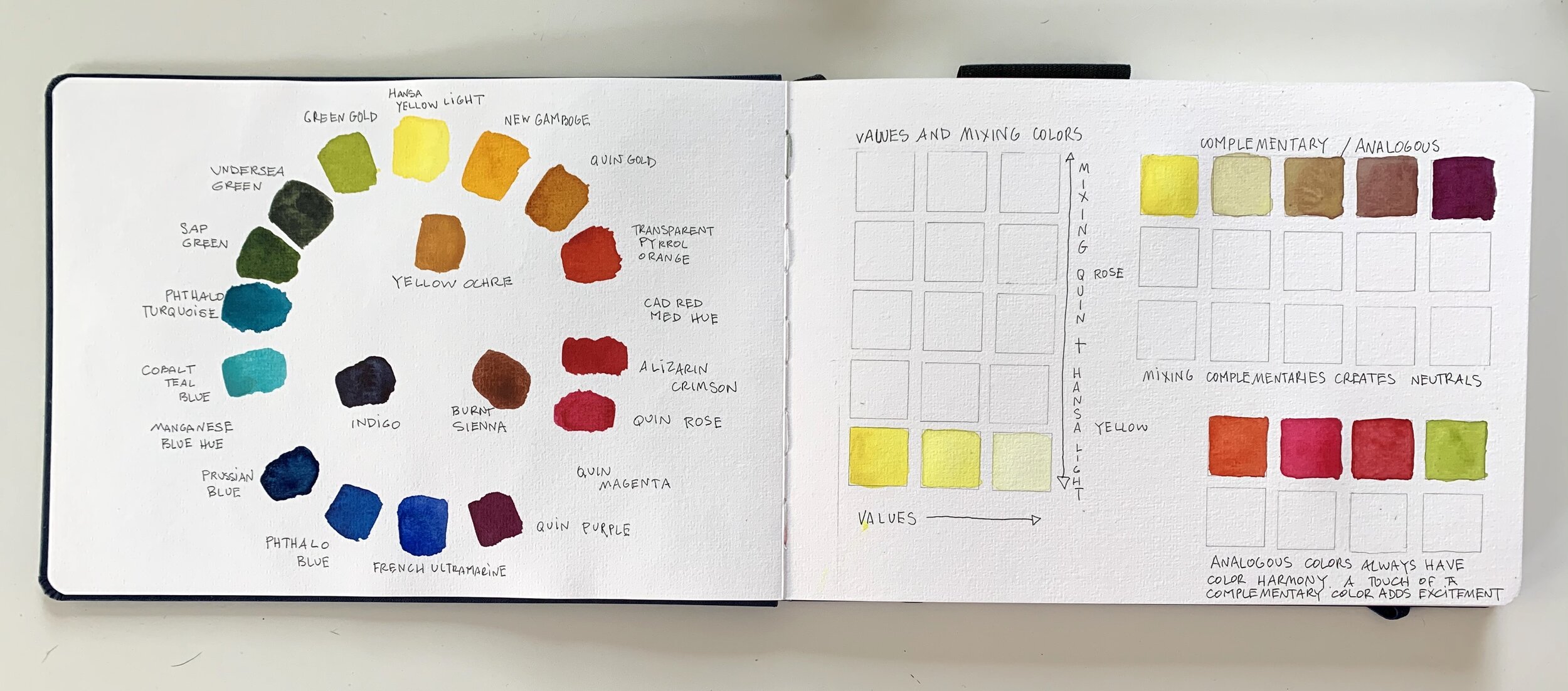
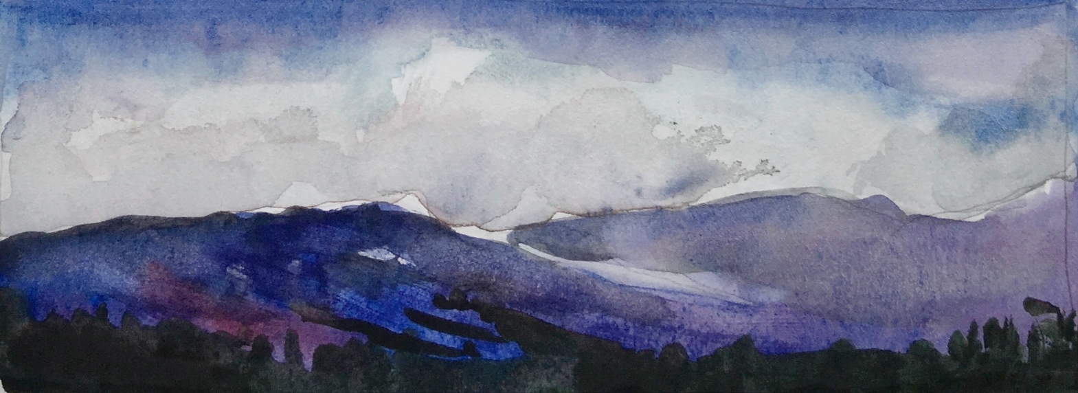
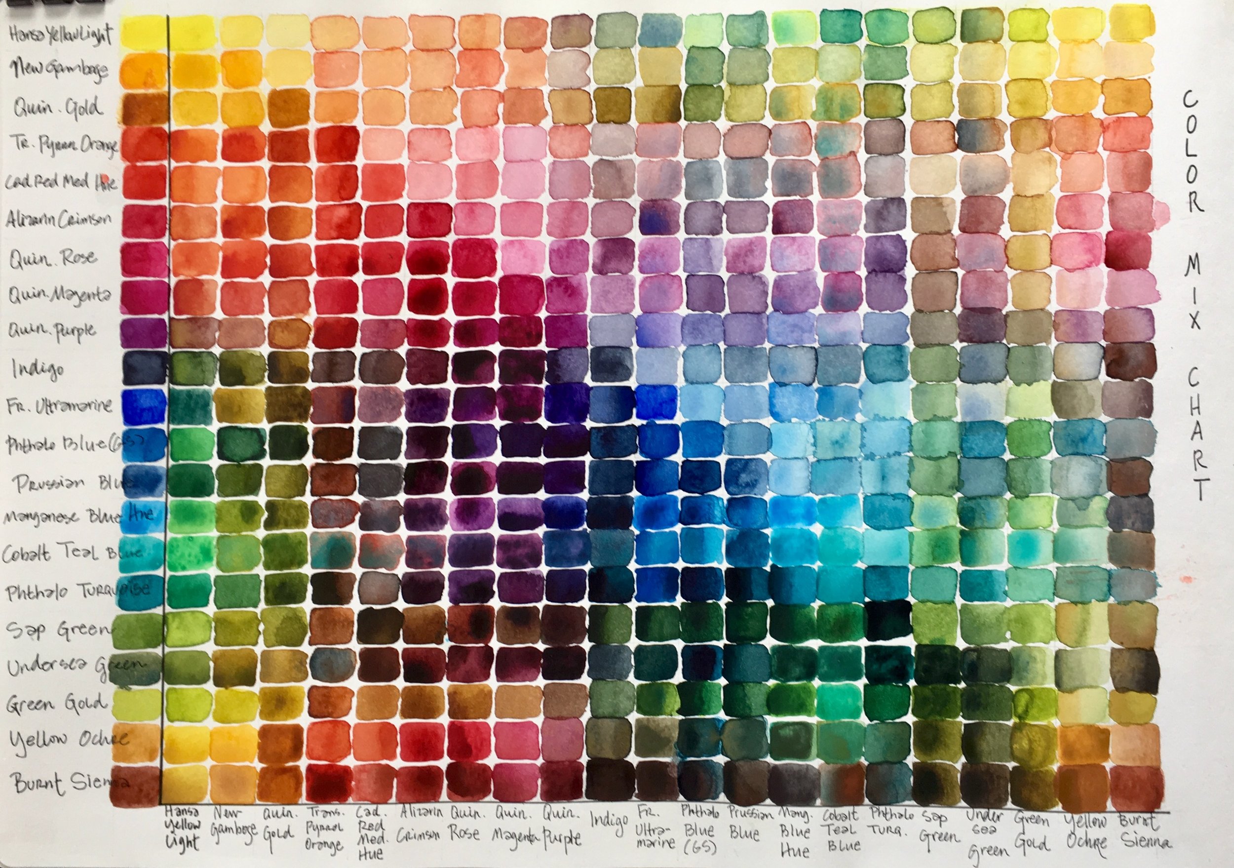
Below are some pages from my sketchbook, highlighting a few of the exercises we will cover in this workshop.
Come join me for this color workshop!
Wednesdays 10am- 12:30pm
January 8 - February 26, 2020
Designed to help watercolor artists understand both color theory and paint properties, we will explore the properties of watercolor pigments (transparent, opaque, staining, fugitive, granulating, on my!) and we will look at different ways of mixing color (on the palette, on the paper, wet-into-wet, glazing). We will experiment with color temperature, value, and intensity of pigments. We will learn about the advantages of painting with a limited palette and we will make a lot of color charts in the process.
We will play with formulas that work well for specific subjects (skies, skin, shadows). We will explore how to match colors and study classic compatible palettes (colors that work well together in a painting). We will look at the emotions of colors and explore the use of color through art history.
Each of the lessons of our workshop will introduce new ideas and exercises, new paints, techniques, and challenge you to think about color in new ways. You will get a creative workout, but in a relaxed, supportive setting, where experimentation and play are encouraged while techniques and observation are emphasized.
For more information and to register please visit
www.charlenecollinsfreeman.com/workshops/
#bothell #woodinville #kenmore #kirkland #millcreek #canyonpark#watercolors #watercolorsworkshop #watercolorworkshop#understandcolor #colortheory #watercolorist@cloud9artschool@charlenecollinsfreemanart
Understanding Color: Compatible Color Wheels
In my upcoming Understanding Color for the Watercolorist workshop, we will explore colors by creating compatible color palettes using just three primary colors for all the mixes of each palette. These exercises are designed to explore the properties of watercolor pigments and mixes.
By creating compatible color palettes we can start to understand how to create color harmony and specific moods; we see how paint characteristics affect mixes and we explore our personal preferences.
Here are the palettes and a few annotations on each one. I encourage you to make your own palettes and observations with your own paints.
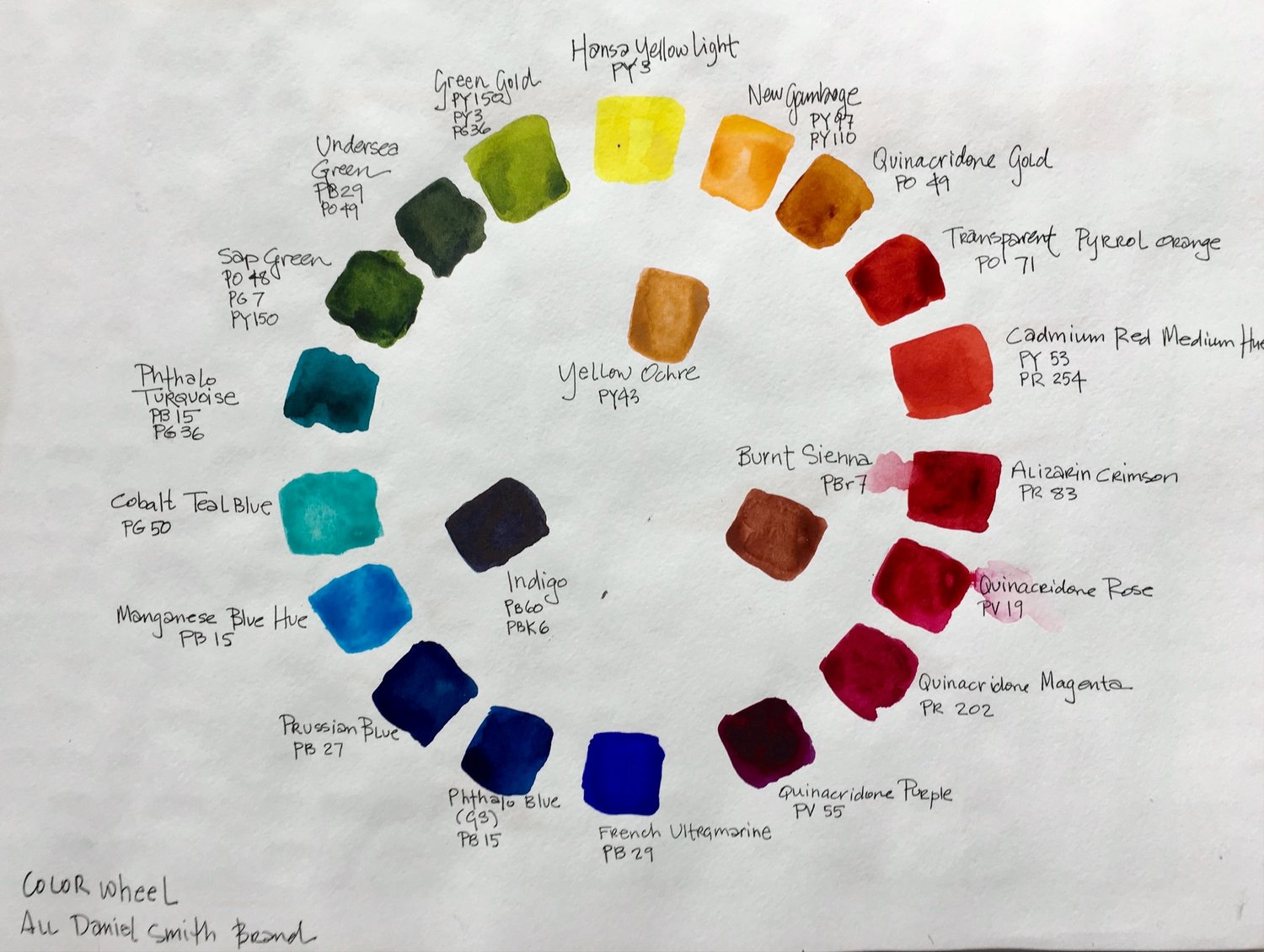
I used Daniel Smith paints for all of these color wheels.
Delicate palette: Hansa Yellow Light, Quin Rose, French Ultramarine
Delicates are all transparent watercolors. They layer well in paintings.
Standard palette: New Gamboge, Cadmium Red Medium, French Ultramarine
This standard palette has a lot of earthy mixes and a wide range of values. It also has high intensity colors to toned down colors. This color wheel has both transparents and opaques.
Intensity palette: Hansa Yellow Light, Alizarin Crimson, Phtahlo Blue
This is a bold, energetic palette with values that range from the lightest to the darkest possible. Rich and intense mixes at full strength but when diluted creates sensitive and elegant mixes. These paints are transparents.
Opaque palette: Yellow Ochre, Burnt Sienna, Manganese Blue Hue
The palette has a limited color range but the low intensity of these mixes harmonize beautifully. These paints are all opaque and will get muddy and chalky if they are over mixed.
The Old Masters’ palette: Yellow Ochre, Burnt Sienna, Indigo or Payne’s Grey
This is a subtle, neutral palette without any real purples. It is limited in scope but also creates strong unity. These paints are a mix of transparents and opaques.
Bright Earth palette: Quin Gold, Transparent Pyrrol Orange, Indigo or Payne’s Grey
More transparent and brighter than the Old Masters Palette, this also has a nice value range. The paints are transaprents.
To make your own compatible color palettes, put your yellow at the top in the 12 o’clock position, your red at the 4 o’clock position, and your blue at the 8 o’clock position.
Label your color wheel with the paint names.
Mix your secondary and tertiary colors.
In the center of each color wheel, create neutrals by mixing colors that are across from each other on the color wheel (complementary colors).
Once you've painted your compatible palettes color wheels, compare them to each other by painting a simple scene with each palette. Since you will be painting this image six times, use something with big shapes and limited details.
Underneath each painting, write the name of the palette you used and make some notes about your reactions and thoughts about each palette.
You can expand each palette by exploring new colors that might work well. Make mixes with the original triads and the new colors. Some colors will work better than others. Look for harmony and compatibility. Write the names of newly introduced paints down next to the palette. In addition to understanding color mixing better, these palettes will be really helpful in harmonizing your color choices for new paintings.
Exploring colors is an ongoing journey. Go play with your colors!
I am offering the workshop Understanding Colors for the Watercolorist, to start in January! It will be held at Cloud 9 Art School in Bothell.
Wednesdays 10am- 12:30pm
January 8 - February 26, 2020
Designed to help watercolor artists understand both color theory and paint properties, we will explore the properties of watercolor pigments (transparent, opaque, staining, fugitive, granulating, on my!) and we will look at different ways of mixing color (on the palette, on the paper, wet-into-wet, glazing). We will experiment with color temperature, value, and intensity of pigments. We will learn about the advantages of painting with a limited palette and we will make a lot of color charts in the process.
We will play with formulas that work well for specific subjects (skies, skin, shadows). We will explore how to match colors and study classic compatible palettes (colors that work well together in a painting). We will look at the emotions of colors and explore the use of color through art history.
Each of the lessons of our workshop will introduce new ideas and exercises, new paints, techniques, and challenge you to think about color in new ways. You will get a creative workout, but in a relaxed, supportive setting, where experimentation and play are encouraged while techniques and observation are emphasized.
For more information and to register please visit
www.charlenecollinsfreeman.com/workshops/
Color in a picture is like enthusiasm in life. - Vincent van Gogh
Circle Trees
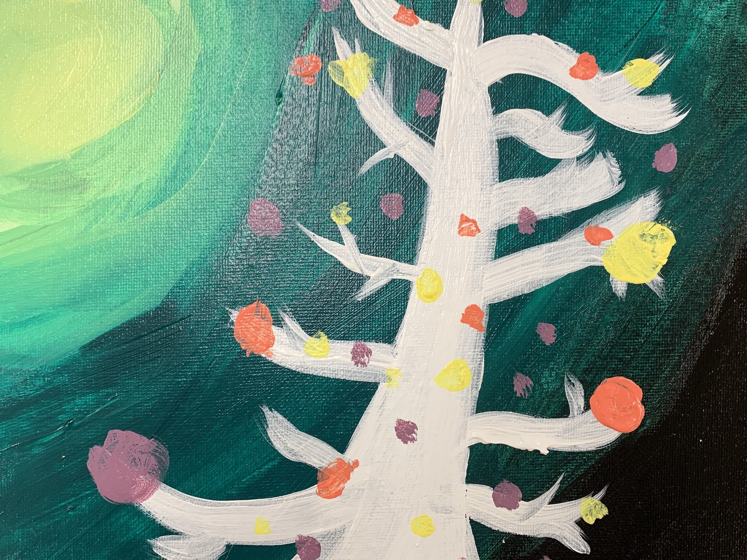
In my 9-12 year old art class, we’ve been learning techniques on blending in acrylics while studying color theory. After practicing brush strokes and experimenting with different color combinations, these young artists set to work painting these circle trees.
Love the paintings they created! I really do have the best job ever.
Student work from my workshop on sketching buildings
STUDENT BRAG ALERT
Yesterday was the last day of my workshop on drawing perspective and buildings. Here are just a handful of the sketches created by my awesome students. I had so much fun with this class! Thank you all for making my job the best job there is!
My next class in my sketching series is Sketching People.
Located at Cloud 9 Art School
18414 103rd Ave NE
Bothell, WA 98011
Wednesdays 10:00am - 12:30pm
November 13 - December 18, 2019
(no class on November 27)
For more info click here.
#sketchingworkshop #sketchingbuildings #bestjobever @cloud9artschool
Understanding Color: Hue & Value
Properties of colors include hue, value, saturation, and temperature.
Hue refers to the name of the color. A hue is a given color created by a specific wavelength of light.
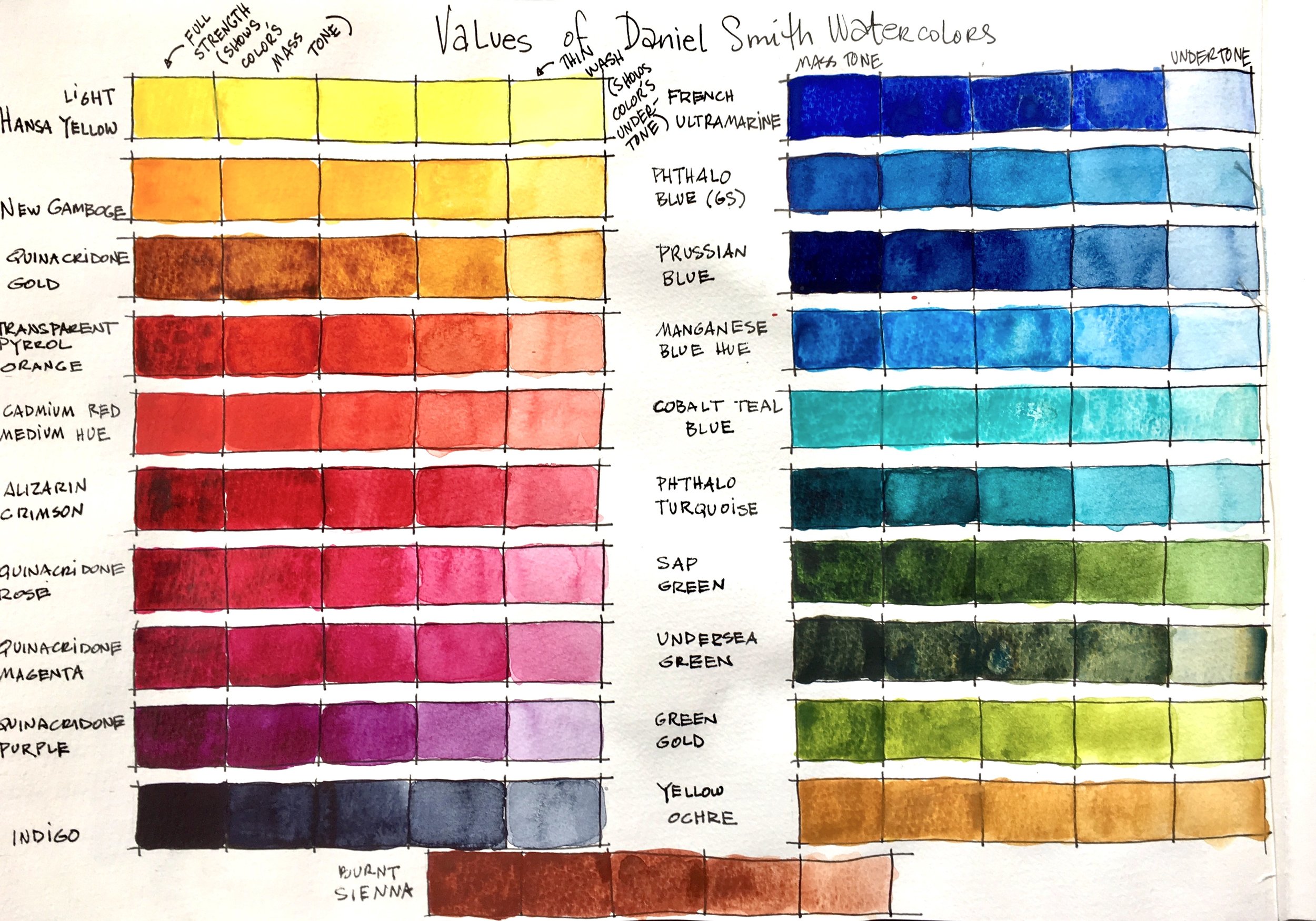
Value is the degree of light and dark of a color. You can use it to create contrast and to add visual drama to your work. In watercolor, we add water (not white paint) to a mix to make it lighter. To make it darker, we add more of the hue we are painting with (not black paint).
The water-to-paint ratio is what creates value in watercolors. Learning to control that ratio is key to mastering watercolors.
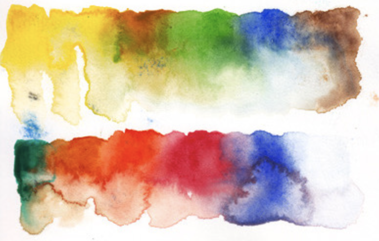
To practice this technique, paint swatches of all your colors from dark to light so as to create a value shift. A common way to identify the water to paint ratio is to think in terms of the consistency of your mix: butter is thick and the darkest mix, add a small amount of water and the consistency is that of cream, making the mix less thick and less dark. By adding a bit more water, the consistence is that of whole milk. More water still, skim milk. And for the lightest value, the mix should have the consistency of weak tea. This swatch will be very light indeed.
If you paint swatches at each of these consistencies, you will get a handle on each color at full strength and at a diluted value. Make value studies of each of your colors with these five values. You’ll notice that some colors don’t have that much of a range. They can’t get any darker then what you achieve in 3 or 4 values no matter how much paint you add to the mixture. Good to know!
The swatches of our colors that are at full strength show us that color’s mass tone.
The value of the pigment diluted to the thinnest wash shows us the undertone.
Painting your values this way will help you see what color is actually inside each tube because looking at the color in your palette does not reveal its real color, mass tone or undertone. Some colors look completely different on paper than in your palette and can look quite different at full strength (mass tone) as compared to a lighter undertone.
To explore values further, consider painting a simple scene with only one color, diluting the paint as necessary to achieve various values. I painted this watercolor of a fan using Lamp Black.
These exercises will help you learn a lot about your paints before you dive into your next painting.
Enjoy!
I am offering the workshop Understanding Colors for the Watercolorist, to start in January! It will be held at Cloud 9 Art School in Bothell.
Wednesdays 10am- 12:30pm
January 8 - February 26, 2020
Designed to help watercolor artists understand both color theory and paint properties, we will explore the properties of watercolor pigments (transparent, opaque, staining, fugitive, granulating, on my!) and we will look at different ways of mixing color (on the palette, on the paper, wet-into-wet, glazing). We will experiment with color temperature, value, and intensity of pigments. We will learn about the advantages of painting with a limited palette and we will make a lot of color charts in the process.
We will play with formulas that work well for specific subjects (skies, skin, shadows). We will explore how to match colors and study classic compatible palettes (colors that work well together in a painting). We will look at the emotions of colors and explore the use of color through art history.
Each of the lessons of our workshop will introduce new ideas and exercises, new paints, techniques, and challenge you to think about color in new ways. You will get a creative workout, but in a relaxed, supportive setting, where experimentation and play are encouraged while techniques and observation are emphasized.
For more information and to register please visit
www.charlenecollinsfreeman.com/workshops/
Color in a picture is like enthusiasm in life. - Vincent van Gogh

