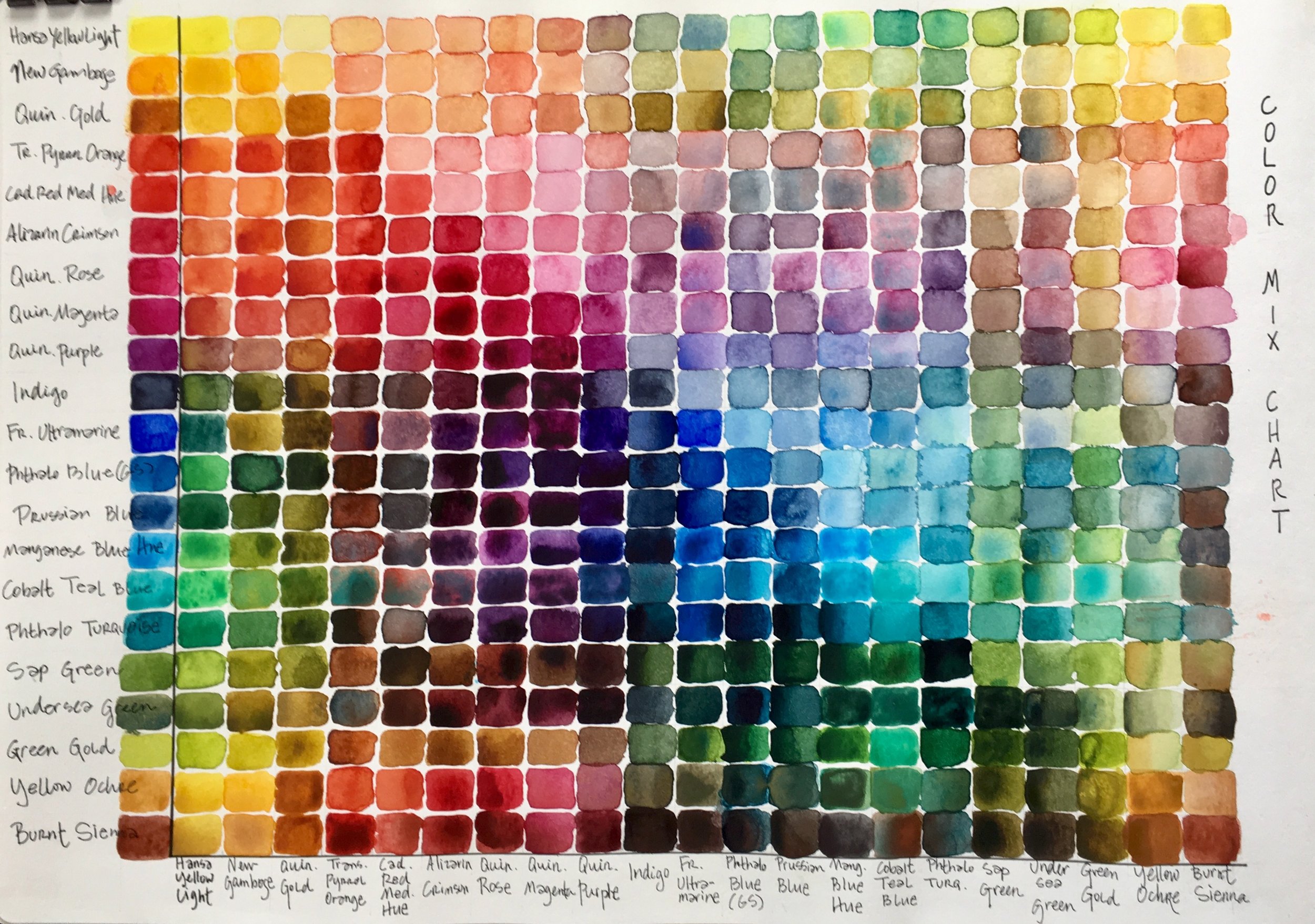
In my upcoming Understanding Color for the Watercolorist workshop, we will explore colors by creating compatible color palettes using just three primary colors for all the mixes of each palette. These exercises are designed to explore the properties of watercolor pigments and mixes.
By creating compatible color palettes we can start to understand how to create color harmony and specific moods; we see how paint characteristics affect mixes and we explore our personal preferences.
Here are the palettes and a few annotations on each one. I encourage you to make your own palettes and observations with your own paints.
I used Daniel Smith paints for all of these color wheels.
Delicate palette: Hansa Yellow Light, Quin Rose, French Ultramarine
Delicates are all transparent watercolors. They layer well in paintings.
Standard palette: New Gamboge, Cadmium Red Medium, French Ultramarine
This standard palette has a lot of earthy mixes and a wide range of values. It also has high intensity colors to toned down colors. This color wheel has both transparents and opaques.
Intensity palette: Hansa Yellow Light, Alizarin Crimson, Phtahlo Blue
This is a bold, energetic palette with values that range from the lightest to the darkest possible. Rich and intense mixes at full strength but when diluted creates sensitive and elegant mixes. These paints are transparents.
Opaque palette: Yellow Ochre, Burnt Sienna, Manganese Blue Hue
The palette has a limited color range but the low intensity of these mixes harmonize beautifully. These paints are all opaque and will get muddy and chalky if they are over mixed.
The Old Masters’ palette: Yellow Ochre, Burnt Sienna, Indigo or Payne’s Grey
This is a subtle, neutral palette without any real purples. It is limited in scope but also creates strong unity. These paints are a mix of transparents and opaques.
Bright Earth palette: Quin Gold, Transparent Pyrrol Orange, Indigo or Payne’s Grey
More transparent and brighter than the Old Masters Palette, this also has a nice value range. The paints are transaprents.
To make your own compatible color palettes, put your yellow at the top in the 12 o’clock position, your red at the 4 o’clock position, and your blue at the 8 o’clock position.
Label your color wheel with the paint names.
Mix your secondary and tertiary colors.
In the center of each color wheel, create neutrals by mixing colors that are across from each other on the color wheel (complementary colors).
Once you've painted your compatible palettes color wheels, compare them to each other by painting a simple scene with each palette. Since you will be painting this image six times, use something with big shapes and limited details.
Underneath each painting, write the name of the palette you used and make some notes about your reactions and thoughts about each palette.
You can expand each palette by exploring new colors that might work well. Make mixes with the original triads and the new colors. Some colors will work better than others. Look for harmony and compatibility. Write the names of newly introduced paints down next to the palette. In addition to understanding color mixing better, these palettes will be really helpful in harmonizing your color choices for new paintings.
Exploring colors is an ongoing journey. Go play with your colors!
I am offering the workshop Understanding Colors for the Watercolorist, to start in January! It will be held at Cloud 9 Art School in Bothell.
Wednesdays 10am- 12:30pm
January 8 - February 26, 2020
Designed to help watercolor artists understand both color theory and paint properties, we will explore the properties of watercolor pigments (transparent, opaque, staining, fugitive, granulating, on my!) and we will look at different ways of mixing color (on the palette, on the paper, wet-into-wet, glazing). We will experiment with color temperature, value, and intensity of pigments. We will learn about the advantages of painting with a limited palette and we will make a lot of color charts in the process.
We will play with formulas that work well for specific subjects (skies, skin, shadows). We will explore how to match colors and study classic compatible palettes (colors that work well together in a painting). We will look at the emotions of colors and explore the use of color through art history.
Each of the lessons of our workshop will introduce new ideas and exercises, new paints, techniques, and challenge you to think about color in new ways. You will get a creative workout, but in a relaxed, supportive setting, where experimentation and play are encouraged while techniques and observation are emphasized.
For more information and to register please visit
www.charlenecollinsfreeman.com/workshops/
Color in a picture is like enthusiasm in life. - Vincent van Gogh


