
I recently finished Tea Party, a watercolor and color pencil painting (14 x 17 in. / 36 x 43 cm.). The inspiration for this painting was actually the teacup, a present from a good friend of mine. I sort of, very loosely, collect teacups. I love the mismatched beauty of this collection.
The flower and the butterfly were invited to the painting after the teacup arrived. I've put together a few work-in-progress photos to share with you, how a Tea Party came to be.
First, a very light pencil drawing on Arches 140 lbs cold press watercolor paper. I've darkened the lines here so that the drawing can show up better.


I applied a granulating paint for the background, my newest favorite Daniel Smith watercolor, Rose of Ultramarine. I applied it lightly, knowing I would darken it later, after I painted in the subjects. I lightly painted over the shape of the butterfly, knowing I would want the same background color to show up in it.

Next I painted the subjects and color penciled a few details on the butterfly. I made sure to add light touches of Rose of Ultramarine into the flower and the butterfly, to make sure the subjects tied in with the background. At this point I was able to gauge how dark I wanted my background.
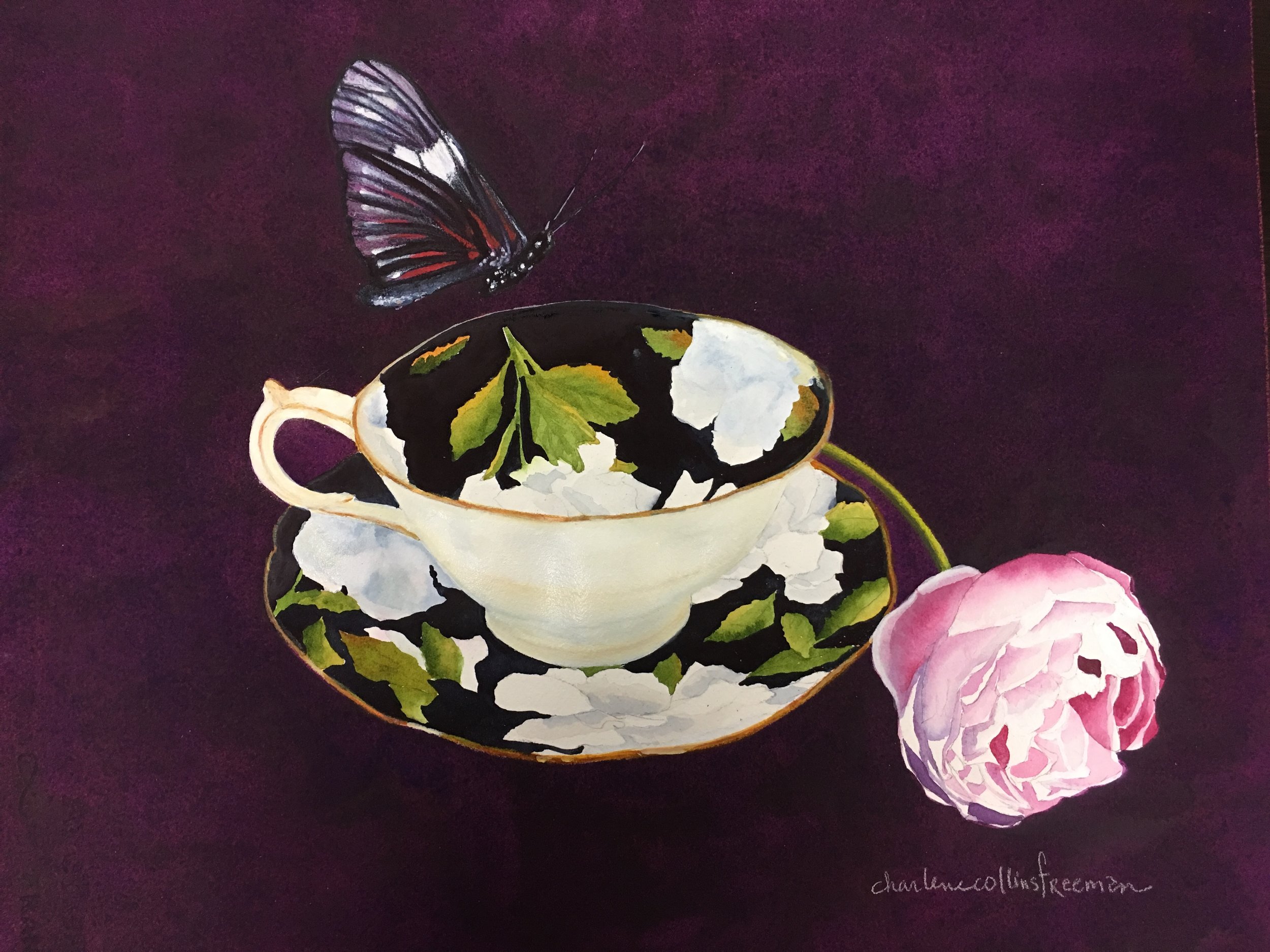
I did two more washes of Rose of Ultramarine on the background to enhance the contrast with the white parts of the subject. The white highlights in the flower and the white petals in the teacup really pop in contrast to such a dark background.
Once that background was done, I reevaluated my contrast throughout the painting and made a few small adjustments.
My husband supplied the title. Happy tea time!